Hot Toys MMS429 - Return of the Jedi Luke Skywalker

Collector Freaks Forum

Help Support Collector Freaks Forum:

This site may earn a commission from merchant affiliate links, including eBay, Amazon, and others.
Stop posting pictures -- where's your video?

Uploading now, but for now, more pics! Lol. These pics are fat suit completely removed.
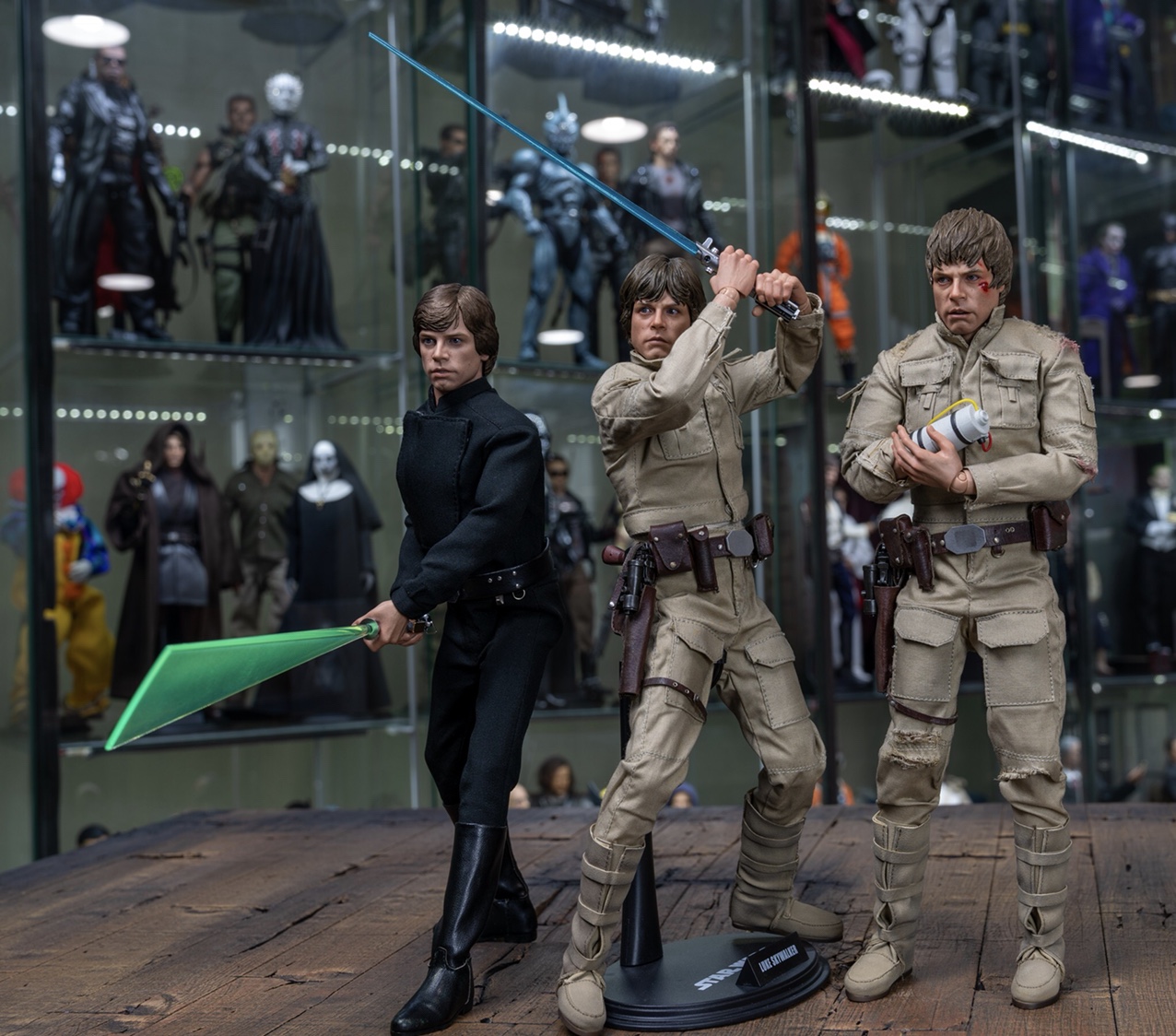
2d31322574123b71cd1fcf527305ab4f.jpg
c1694c882f70fd906e50a28213907129.jpg
4e8d52a1abf6c4bbfc96748da3976795.jpg
680e6b21765e16d434c6f58110692819.jpg
84b122418966ea5835bfe220817c0527.jpg


Sent from my iPhone using Tapatalk
 
Uploading now, but for now, more pics! Lol. These pics are fat suit completely removed.
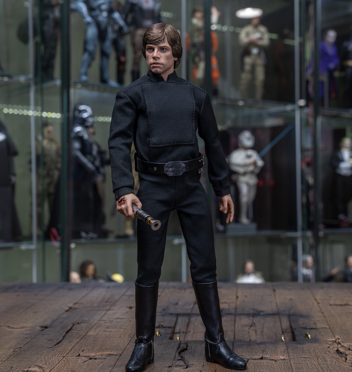
2d31322574123b71cd1fcf527305ab4f.jpg
c1694c882f70fd906e50a28213907129.jpg
4e8d52a1abf6c4bbfc96748da3976795.jpg
680e6b21765e16d434c6f58110692819.jpg
84b122418966ea5835bfe220817c0527.jpg


Sent from my iPhone using Tapatalk

Curious if you have a preference or opinion on padding vs no padding (fat suit). Since I can't sew worth a damn, I wouldn't be able to take in the actual outfit, and I'm wondering if the clothes look baggy at all (in person) when the padding is removed and suit left unaltered?
 
Just want to correct a few things. I misspeak during the end when I say that the sculpt is a 8-8.5, as I feel it is a 7.5 to an 8, which is what I originally said during my sculpt discussion earlier in the vid. Also, another tailoring issue I really don't like is that from certain angles, the white portion of the inner shirt that flips over sticks out too much, especially from the border. Just wanted to clarify those things. Lol.
 
I really want to order this!
It looks good, I do wish Luke had a more intense expression (especially as a second head) and the padded under suit wasn't so thick in the middle, my only complaints.
 
Uploading now, but for now, more pics! Lol. These pics are fat suit completely removed.
680e6b21765e16d434c6f58110692819.jpg
84b122418966ea5835bfe220817c0527.jpg


Sent from my iPhone using Tapatalk

The only thing I'm not liking about the no-fat suit look is that the shoulder seam drops down a bit below the shoulder and you also get a bit of a cavity that opens up below the armpit area. Like a smaller body in a too-broad-shouldered shirt. Not especially bad, but noticeable.

In certain pics the rectangular panel on his shirt front looks like a cushion cover glued to his chest - it reads as a bit too thick/fat and the stitching a bit out of scale, but it only seems noticeable in certain lighting. It may just be a limitations of 1/6 scale thing - it has to be at least two layers of fabric thick (maybe 4 if its got a white panel all the way to the bottom on the inside.)
 
Curious if you have a preference or opinion on padding vs no padding (fat suit). Since I can't sew worth a damn, I wouldn't be able to take in the actual outfit, and I'm wondering if the clothes look baggy at all (in person) when the padding is removed and suit left unaltered?

It’s tough dude. If you keep the fat suit on, he looks too chubby, however when you remove it, the chest of the body almost protrudes a tad too much which potentiates the fabric as well, but it is better though. HT could have made the fabric a tad tighter, but you may or may not lose articulation with that. You can aalso futz with the fat suit to a certain degree as well. Without the fat suit or with it, I find it all depends on how you pose him, but without the fat suit makes several more poses look much better.


Sent from my iPhone using Tapatalk
 
The only thing I'm not liking about the no-fat suit look is that the shoulder seam drops down a bit below the shoulder and you also get a bit of a cavity that opens up below the armpit area. Like a smaller body in a too-broad-shouldered shirt. Not especially bad, but noticeable.

In certain pics the rectangular panel on his shirt front looks like a cushion cover glued to his chest - it reads as a bit too thick/fat and the stitching a bit out of scale, but it only seems noticeable in certain lighting. It may just be a limitations of 1/6 scale thing - it has to be at least two layers of fabric thick (maybe 4 if its got a white panel all the way to the bottom on the inside.)

It could be a clothing issue for sure, because it protrudes out no matter what, and the chest of the body itself does not help either. The Yunsil custom outfit looks a little bit better, however also protrudes to a degree as well, however you can limit it with certain lighting. You can just about alter any picture depending on how you light the figure, especially when the outfit is black. I try to bring out all the detail in a figure I can, so folks can really see how this figure looks in display lighting. Make no mistake, no matter if you keep the fat suit in or out, you will have to manipulate this figure quite a bit to make it look how you choose. With the fat suit out, and in certain poses, he looks perfect, and others, the arms and chest look baggy.


Sent from my iPhone using Tapatalk
 
the sculpt looks great in your video, and I believe it is defintely better than DX07 sculpts.
This will be even more obvious when Hot Toys releases Endor Luke, and buyers can swap, hair styles, helmet...

It is a pity that they messed up with the excessive fatsuit. I like Luke better without it, but I don't know... I believe that an intermediate fix, such as what Timemeddler did, is the way to go.
Completely removing the fatsuit is too much, IMO.

I believe the biggest upgrade for those that got the Yunsil outfit is the cloak, though. Yunsil's work on the cloak is clearly superior to HT, in my opinion.

Thanks a lot for the video, I Am Toys. Always a pleasure.
That’s because Hot Toys doesn’t know how to make cloaks. Or hats, apparently. Actually... why do we buy their figures again? :lol
 
It could be a clothing issue for sure, because it protrudes out no matter what, and the chest of the body itself does not help either. The Yunsil custom outfit looks a little bit better, however also protrudes to a degree as well, however you can limit it with certain lighting. You can just about alter any picture depending on how you light the figure, especially when the outfit is black. I try to bring out all the detail in a figure I can, so folks can really see how this figure looks in display lighting. Make no mistake, no matter if you keep the fat suit in or out, you will have to manipulate this figure quite a bit to make it look how you choose. With the fat suit out, and in certain poses, he looks perfect, and others, the arms and chest look baggy.

Moving to Arizona huh. That's gotta be a pain to pack up all the figures, or are they staying in the current house ?

Hope you found a new house with a smoke detector beep in Arizon. Kind of miss it in the reviews....:lol
 
The only thing I'm not liking about the no-fat suit look is that the shoulder seam drops down a bit below the shoulder and you also get a bit of a cavity that opens up below the armpit area. Like a smaller body in a too-broad-shouldered shirt. Not especially bad, but noticeable.

In certain pics the rectangular panel on his shirt front looks like a cushion cover glued to his chest - it reads as a bit too thick/fat and the stitching a bit out of scale, but it only seems noticeable in certain lighting. It may just be a limitations of 1/6 scale thing - it has to be at least two layers of fabric thick (maybe 4 if its got a white panel all the way to the bottom on the inside.)

The rectangular panel is the worst offender to me. I think this sculpt beats the Bespin one though so I’ll be happy to have this in Jabba’s palace garb as the sole “main” look.

But I definitely plan on checking out the SS version if the tailoring comes out better. Could probably part out the rest pretty easily and break even.
 
It doesn’t matter if the fat suit is on or off, the tailoring for the shoulders is too broad in every picture I’ve seen so far. Seeing how crazy good Yondu looks then going back and looking at this has really put me on the fence. I’m fine with the sculpt, it really is just this crap tailoring that they screwed up so much from the proto, and really the only “fix” is to pose it in a way that minimizes it. At this point I’m only leaning towards keeping my order because he seems like a good value for the price point. I will definitely be keeping the second vest on if I do.


Sent from my iPad using Tapatalk
 
It doesn’t matter if the fat suit is on or off, the tailoring for the shoulders is too broad in every picture I’ve seen so far. Seeing how crazy good Yondu looks then going back and looking at this has really put me on the fence. I’m fine with the sculpt, it really is just this crap tailoring that they screwed up so much from the proto, and really the only “fix” is to pose it in a way that minimizes it. At this point I’m only leaning towards keeping my order because he seems like a good value for the price point. I will definitely be keeping the second vest on if I do.

I'm a bit the same. Either way if I don't like it I think he'll always be pretty sellable.
 
Back
Top