Hot Toys Two-Face???

Collector Freaks Forum

Help Support Collector Freaks Forum:

This site may earn a commission from merchant affiliate links, including eBay, Amazon, and others.
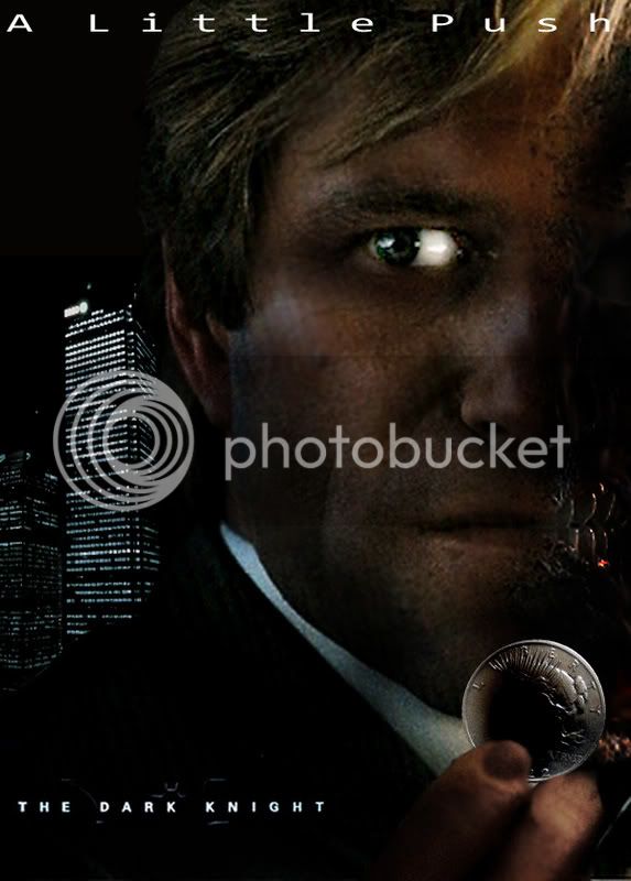
Great shots! I really like how in the car shot you can see through his face and out the window, and not only have they burnt his face, but when you look at how much lower the left side of his chin sags, they've also melted it. (edit: ok, I just couldn't distinguish his jawline/chin from the burned neck below - no sagging here, just crispiness)

On another note, Harvey's dentist is superb...those have got to be some of the nicest teeth I've ever seen, I don't care if the man does only have half a face - he should be doing Crest commercials.
 
You can really tell that Nolan pointed his art team to Tim Sales work on Long Halloween and said"I want this but make it as real as possible while keeping this look". Thats the impression I got was Sales Two-Face brought to life.
 
That's the only thing that killed me about Harvey was his eye (my attention was fixed on it). I wish it had been super damaged or just missing altogether. That would have pissed off fanboys though, and we'd still be hearing about it.

EDIT: And, thank you for the pics Hecubus. Very kind of you.
 
Two-Face's face:

Can you tell us anything about how the Harvey Dent or Two-face makeup worked? Because Aaron didn't want to talk about it.

Christopher Nolan: Oh yeah? Well, the thing I will say which, depending who your audience is, certainly for film sophisticates, if you like, it's very apparent that it's done primarily using computer graphics. And that was a choice I made because I wanted the look to be so extreme as to be a little bit fanciful. When we looked at doing sculpts of the look, you know, in clay, of Aaron's face and how it would look degraded in different ways, uh, the more subtle the mutilation, the more horrible and depressing it was somehow, and it's the one area of the film where I felt that being a little more fanciful, being a little bit less uh, less real, realistic I should say, and having just a lot of interesting sculptural detail in it for the audience to look at, have a morbid fascination with--that was the term we were looking for. We don't want people to, you know, we don't want them throwing up their popcorn and we don't want them looking away from the screen. We want them to be able to engage with his character. So we wanted it to be a little bit fanciful.

scan0034.jpg
 
That Nolan quote is interesting. I never really thought about it but I was really intrigued by the exposed tissue by the mouth and the bone on the chin. My eye was drawn to the exposed parts but they did a good job of not making the face too repulsive.
 
like the Scorpion King at the end of the mummy 2 i think, horrible cgi

I agree, I always think of that as a bad example of CGI, but that was like 2001 before Sub-Surface Scattering (how light penetrates skin to give a realistic look, like how you get red edges when you hold your hand to the light). And that really helps sell realism.

What's also interesting about CGI---the more imperfect stuff that's added the more realistic it looks.
 
Picked up cinefex magazine today, really amazed at the quality of the prints and the magazine itself, it's almost like a book it's so nice. I'll make some high res scans tonight and post them in the TDK High Res Image thread and let folks know in here.
 
Picked up cinefex magazine today, really amazed at the quality of the prints and the magazine itself, it's almost like a book it's so nice. I'll make some high res scans tonight and post them in the TDK High Res Image thread and let folks know in here.

Cool! Thanks Sean! I've been wanting to see them.
 
Holy crap, that was amazing cgi work, had no idea most of it was, just thought a little was. The people responsible for that should be VERY proud of themselves, great work!
 
Back
Top