PredatorFreak13
Super Freak
- Joined
- Dec 7, 2008
- Messages
- 392
- Reaction score
- 3
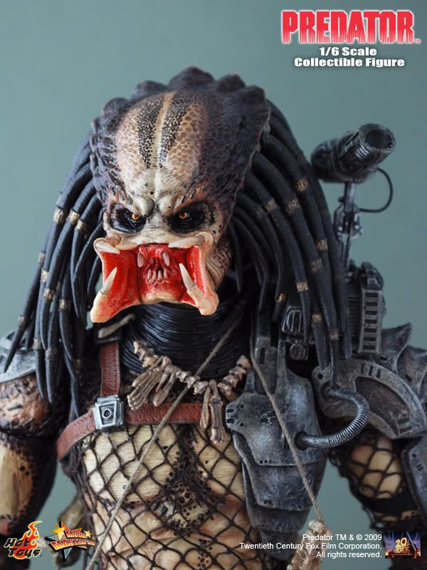
I agree, I think that the P1's face looks a tad bit long.

Well, one of the major factors for me has always been the enormous noggin on the preds. P1 looks a LOT more in proportion!
Well, one of the major factors for me has always been the enormous noggin on the preds. P1 looks a LOT more in proportion!
Hot Toys Predator

My Mod (Photo Manipulation)


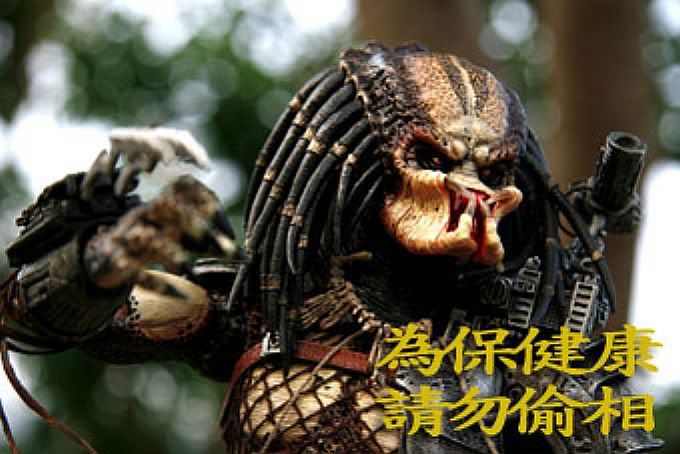
Devil's correct that the "nose" is too long, but one thing that's exaggerating the flaw is that, as you said, his head is titled down. In the film, Predator's head is almost always titled upward, which is going to give the illusion of a shorter "nose".I do think some modification is probably needed, but looking at Devil's tweak, part of the illusion is the viewing angle, Predator's head is tiled down in that shot and from a fair distance back.

the longer the better for me,my wallet need a rest.
 ........
I just remember how nice he looks in this low angle shot and I feel fine


Yup.. part 1, part II and part IIIWell there was a Batman Vs Predator comic for a while.
Seeing as your familiar with the whole Bat vs Pred/Alien thing, I hope you'll take some pics of them posing together!!Plus there's the Batman fan film BATMAN: Dead End.
I do think some modification is probably needed, but looking at Devil's tweak, part of the illusion is the viewing angle, Predator's head is tiled down in that shot and from a fair distance back.
If you compare this image to the Sideshoe life size bust, which is a great reference, it's not as off as some pictures make it looks.
HT takes really nice photos of their figures for marketing, but they do a poor job of showing the depth and true shape of their Predator heads. It's tricky, you have to light and shadow them certain ways, but if you do it then you getter a better feeling they resemble the movie masks.
