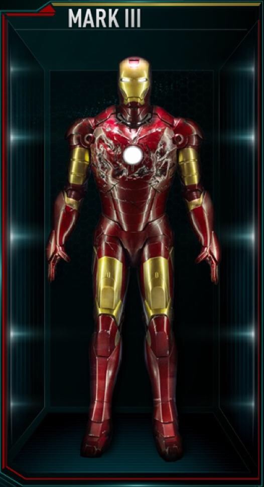
MMS Diecast - Iron Man: 1/6th scale Mark III Collectible Figure

Collector Freaks Forum

Help Support Collector Freaks Forum:

This site may earn a commission from merchant affiliate links, including eBay, Amazon, and others.
You guys seen this yet?

11714329_10153536224712668_604621016_n.jpg

What a mess.

Might as well pick up the original Mk 3 for way cheaper and bang it with a coat black > chrome > clear red and save yourself a couple hundred.
 
What a mess.

Might as well pick up the original Mk 3 for way cheaper and bang it with a coat black > chrome > clear red and save yourself a couple hundred.
I don't think I'll mind loosing my NRD if I cancel this. I figured it would be better then this but must be the pose & lighting so I'm going to wait for more pics.
 
yeah it could just be a bad picture but that doesnt impress me at all. I will wait for the hk photos before i cancel. I dont like the way the proportions look there, skiny hips and legs. It's too soon to judge.
 
I just assumed it was a bad photo, because it looks good apart from the proportions. It's like the lower body is too small for the upper. Hopefully it'll be out in HK soon so we can know for sure.
 
The mk3 proportions are all messed up on screen anyway.
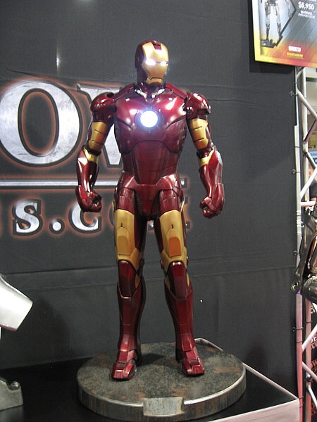
This.

I don't know what people are expecting? The proportions are correct. Go Google Iron Man Mark 3 and you'll see that it's the exact same. The slim legs and thin waist has always been attributes for the Mark 3. It's always had that anoxeric look to it due to its slimness from the waist down.

The only thing that's off is the paint but we've known since Day 1. Nothing new here besides the ****** sculpt and a terrible flash lighting picture.

That sculpt looks disappointing though. Was hoping to see a good Iron Man 1 sculpt again.

Ma8ERk5.jpg

mFnt7VK.jpg
 
I've seen much (much) worse face sculpts on the Iron Man statues.

But until I see a higher resolution, close up pic of the head I'll hold back on just how bad or good the head sculpt actually is.
 
I don't know what people are expecting? The proportions are correct. Go Google Iron Man Mark 3 and you'll see that it's the exact same. The slim legs and thin waist has always been attributes for the Mark 3. It's always had that anoxeric look to it due to its slimness from the waist down.

The only thing that's off is the paint but we've known since Day 1. Nothing new here besides the ****** sculpt and a terrible flash lighting picture.

That sculpt looks disappointing though. Was hoping to see a good Iron Man 1 sculpt again.
You answered your own question.

People are expecting HT get the color of the suit right and a sculpt that doesn't look a step back from the 1.0 version.

Color was off on the proto, no problem as most would acknowledge that a proto is a rushed version just for show and tweaks will be made down the road to get things accurate. HT has had forever and day to get the color right and they simply don't care to fix it.

This costs $310 whereas the original cost $190 and comes with nothing extra to justify the enormous price hike with the exception of it being partially diecast.
 
My post was towards those who were posting about the proportion not the color.

I don't get the whole color thing that Hot Toys is doing myself but for all we know it could be a license thing that Disney/Marvel might have in wanting the Mark 3 being presented in such a manner. Either that or they just don't give a **** and threw red on it to call it a day. Either way I'm guessing the Mark 3 on display is the original prototype since they also have the Age of Ultron Thor with the TDW sculpt on and not the new one.
 
Fighting over the colors again? Didn't we have like 20 pages of discussion/debate about this already? If you have the origibal mark 3 already, hooray for you! This one is really for us who missed out in it. I deserve a figure from the best IM movie. That's all!
 
Most Hot Toys displays in most Asian Exhibitions can make you think of cancelling a preorder til the official photo reviews from the likes of Jingobell and his peers are out. Just bad lighting (perhaps with all the lights from the venue) coupled with lame poses. Sometimes it's the same prototype from Day 1 getting worn and torn after many exhibition appearances too that makes the figure look like a disaster. I can still remember how many people freaked out on HT's Arkham City Batman prototype taken at one Asian exhibit for having paintrubs on chin and chest, ugly seamlines on legs, and that notorious folder clip on its back that seems to be holding the cape and rubber suit altogether. Figure turned out fine in the end.
 
Back
Top