*cough...Phantom...cough*
I like the one on the right.
Agreed.
Jaundiced Superman FTW!
Yes, you made your point. We get it. At this point, those posts aren't providing any useful contribution to the discussion and just constitute trolling, so let's please cut down on it if you don't mind.
Please see my previous post. If you are going to make a critique, please post something more substantive than "THIS LOOKS LIKE A TOY, IT IS A JOKE," etc. Just posting that same thing over and over is tiresome and drags the thread down. Thanks.
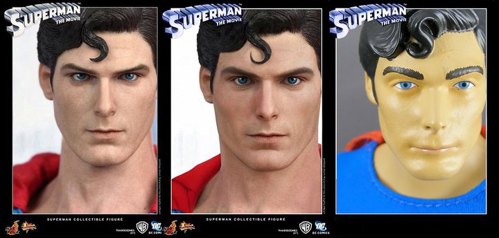
The thing is, Christopher Reeve's suit is very close to the outfit design that Superman has worn in the comics for the majority of his history. The exact shades of red, blue and yellow are not even that far off from the comics (which is debateable depending on which comic coloring you refer to). In fact, when it comes to live-action interpretations of any costumed superhero, I dare say, Reeve's look was the most comic-accurate, before or since....ever.
Even with Dean Cain's outfit with its deeper blue satin look, you could tell the producers were not straying far from the comic design (in the 90's post-Doomsday/death/return, Superman's comic outfit did become a deeper shade of blue)
As for the Brandon Routh costume, it looks like a scuba suit. I never understood the need for the high neckline and the speedo-like swim trunks. The cape and boots are so dark that they are maroon. Thousands of tiny "S" sheilds all over (conterfeit protection?) And overall the thing is too plasticky/rubbery looking. Why does Superman need that much protection? Out of every live action incarnation of Superman, I feel the people behind SR made the most deliberate effort to put their own stamp on the character design. In itself, that's not a bad thing as the costume has subtly evolved anyway, I just think they made too many changes at once.
Enter your email address to join: