Sideshow ESB/ROTJ Darth Vader

Collector Freaks Forum

Help Support Collector Freaks Forum:

This site may earn a commission from merchant affiliate links, including eBay, Amazon, and others.
cooltoyreview pics:

f048m.jpg

wilphh.jpg

3539n36.jpg

91hzzt.jpg

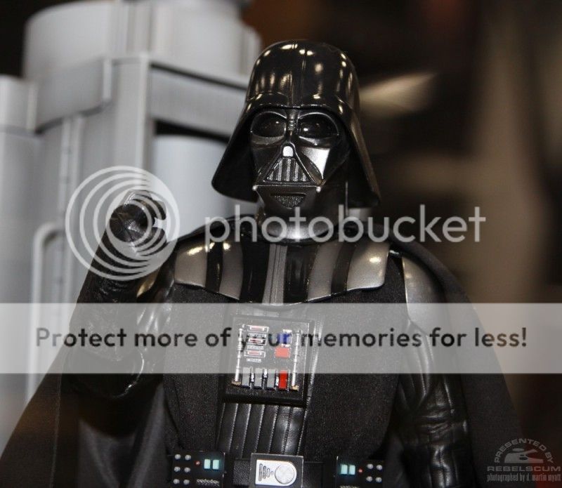
The whole face/helmet part looks identical to the ANH version, including the long bit at the front of the neck that makes it so hard to tilt the head forward.
This certainly looks like a cobbled together figure and not the prototype.
Will wait for final production pics before passing judgement, but this does not look like an "ultimate" figure to me. Yet.
 
No, everyone is allowed to get excited about the awesome parts and to complain about what they feel is off but I just think passing judgment on the figure as a whole should probably wait, that's all... As someone who has scrutinized and modded the ANH Vader dome over and over it's pretty obvious that this is a different piece, I think the issue is that it's not quite sitting low enough on his head.
 
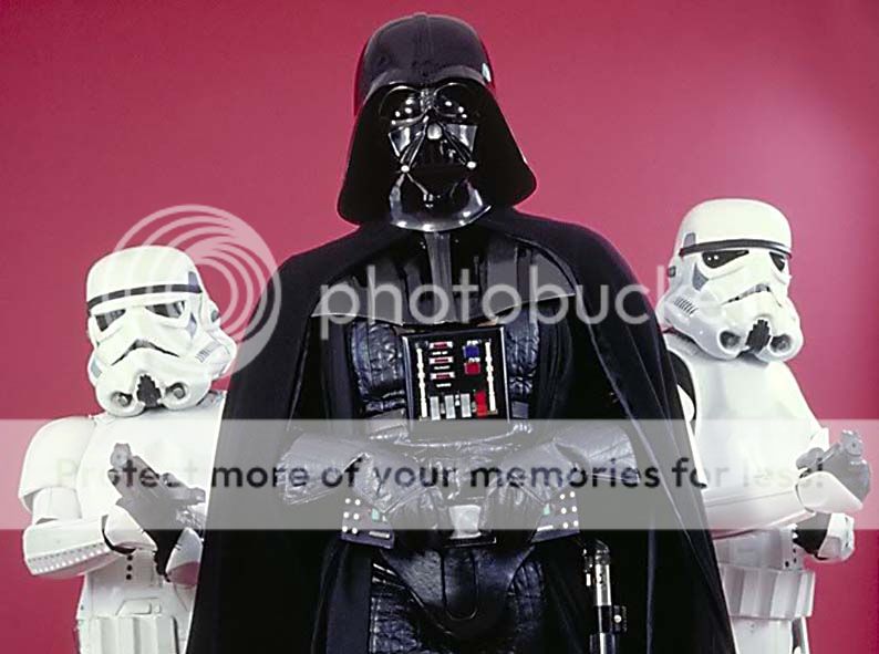
Original-ESB-Vader-Stormtroopers.jpg
f048m.jpg


Don't tell me that dome size and placement on helmet makes this the 'ultimate' vader. Fix that, and we are in business more than not! Look how high on his head the dome sits and how far from his shoulders the dome comes...looks really, really off.

We should not be able to see under the dome and past the room like we do in the 1:6 pic
 
As someone who has scrutinized and modded the ANH Vader dome over and over it's pretty obvious that this is a different piece, I think the issue is that it's not quite sitting low enough on his head.

I can see that what the ANH dome had for a widow's peak is gone, but the mask has no lines for separating. The dome does sit high, but that front shot makes it look like it'll still be too short.

Can modding make the ANH dome look long enough in the back?
 
The leather suit looks better than the last attempt, but it is still way too stiff and rigid looking. The inherent wrinkling of the leather body suit is what makes the look and I doubt that will be achieved with this thick looking pleather. If they used a thinner material and wrinkled it up some more, then it would be much better to emulate the full scale look. The capes are also too heavy and clunky and they need to find a material that hangs and folds better - again, too stiff.

Lowering the dome in the back will probably not fix that it is regrettably undersized and shaped wrong.

Belt boxes and belt buckle is too small too as well as the chest armor and bells. There are very specific dimensions to all these pieces and it just doesn't look like they were scaled down correctly.

However, the body definitely looks to be more proportional and giving the overall figure the right look.

The gloves look really nice... just wondering about the hand pose of that raised arm, very unnatural way the fingers are positioned.
 
Making the dome bigger without even altering shape would fix some of the issues... but if it had to be resculpted anyway, they might as well try and get the other issues besides size right too.

f048m.jpg
 
The leather suit looks better than the last attempt, but it is still way too stiff and rigid looking. The inherent wrinkling of the leather body suit is what makes the look and I doubt that will be achieved with this thick looking pleather. If they used a thinner material and wrinkled it up some more, then it would be much better to emulate the full scale look. The capes are also too heavy and clunky and they need to find a material that hangs and folds better - again, too stiff.

Lowering the dome in the back will probably not fix that it is regrettably undersized and shaped wrong.

Belt boxes and belt buckle is too small too as well as the chest armor and bells. There are very specific dimensions to all these pieces and it just doesn't look like they were scaled down correctly.

However, the body definitely looks to be more proportional and giving the overall figure the right look.

The gloves look really nice... just wondering about the hand pose of that raised arm, very unnatural way the fingers are positioned.
Great post dude! :hi5:

As mentioned already, if this is cobbled together as a placeholder or whatever - why even bother to show it? Long time fans of the OT that know Vader's look at a glance, know when stuff doesn't look right.. pretty much immediately. :lol

To be fair though, scaling everything down doesn't always work out as intended - I can imagine, but still.. :dunno
 
Nice pic comparison, Too Much Garlic (never!!), that is a start, but still looks a smudge too high on his head

Not for ESB. There it should sit just above the eyebrows, barely touching them with the lower edge of the dome. For RotJ it should sit a little higher, but maybe not as high as on the figure.
 
Well, the issue currently is also the dome placement. It is tilting too much forward at the top, pulling the rear up, so my comparison isn't really perfect. Sure, it would probably help to make the dome a little larger, but it needs to be tilting further back.

Currently it has the Don Post and Rubies look to it.
 
Back
Top