That looks magnificent.
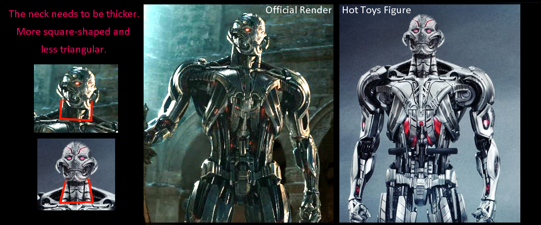
It's time for another "screencap vs. figure" comparison! Surprisingly, that shot actually seems demonstrate how HT managed to nail a lot of the details and proportions on their figure (even the head), except for one blatant part: the neck.

While one might argue that the official render being shot from a lower angle obviously skews the image, this actually makes HT's mistake even more obvious since the lower angle would have emphasized the triangular neck on the official render, but this is simply not the case.
Love the side by side. Thanks for taking the time to do that!
 I was already happy that I preorder this on day one and this is just the cherry on top.


 Let's hope it's not another PI.


