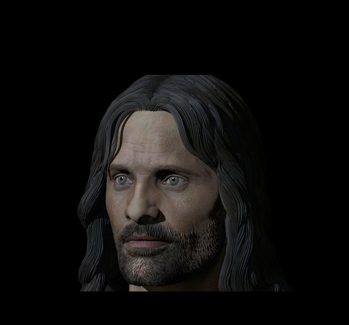
ASMUS TOYS : Aragorn @ The Battle of Helm's Deep

Collector Freaks Forum

Help Support Collector Freaks Forum:

This site may earn a commission from merchant affiliate links, including eBay, Amazon, and others.
Asmus this is the same sculpt that was used for finished product?
attachment.php
If so I wonder if maybe the paint may be throwing it off as this looks pretty damn good to me.
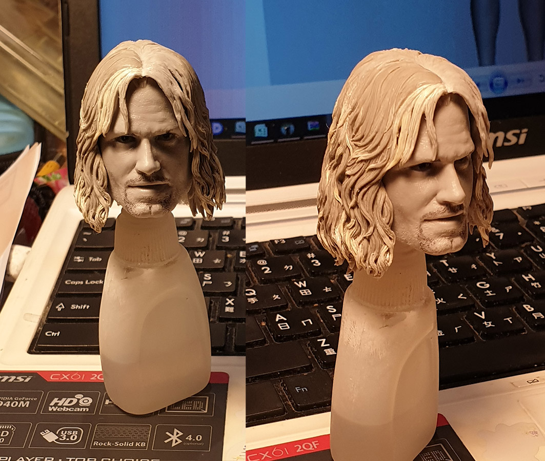

ETA I'm going to throw this in as well. Is this the same head sculpt as the one above and the one that was used in the prototype?
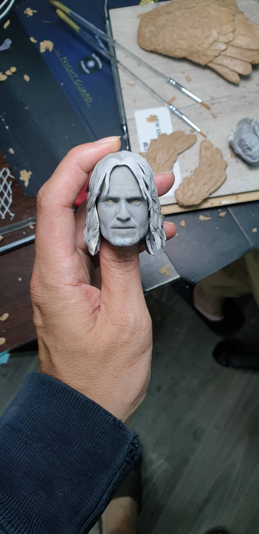
attachment.php


The bottom head sculpt to my eye looks great. If it's the same one as the others than I think the paint is killing the likeness

The unpainted sculpts look great so I guess the paint is throwing it off? I hope we get more final sculpt pics here soon as I am waiting to pull the trigger and to see the tweaked version
 
I'm looking at them on a desk top and I agree. So if they are the same sculpt as the prototype then I don't know what my eyes aren't liking about the painted one.

It could very well be a paint thing for you. I'm sure we've all seen a sculpt painted by different artists where some of those paint ups looks bang on to the actor...but the same sculpt painted a different way can make it like it's missing something. Some artists only know how to paint well...others know how to paint well AND bring out the likeness. Sideshow sculpts in general, especially the old ones had some great likeness, but the production paint just threw the whole thing off. I mean ppl still praise the SS Old Ben Kenobi sculpt as the best 1/6 Alec Guinness sculpt and that it just needs a repaint.
 
Last edited:
Actually it's the top of the nose between the eyes that is just not quite wide enough, and throws the whole thing off...
the rest is pretty much ok.
 
Cheeks seemed to be too full on the painted version but looks better here. Maybe it's the paint job? I know the there is a technique where people put darker makeup on cheeks to make someones face slimmer.
 
Cheeks seemed to be too full on the painted version but looks better here. Maybe it's the paint job? I know the there is a technique where people put darker makeup on cheeks to make someones face slimmer.

Contouring. It accentuates the cheekbones by shadowing beneath the zygomatic arch.
 
Well SooSoo Toys just raised the standard for changeable hair sculpt with their John Wick head. Check it out, Asmus- it’s completely seamless and the centre parted hair comes in two pieces. Would be great to see some new strides in the sculpted hair department with the LOTR stuff.
 
I saw the video showing the magnetic hair. That is definitely the way to go. No unsightly seams and easy to swap on/off.

By the way, that John Wick sculpt looked very good, too.
 
That technique with Wick is interesting. Hair looks cool but likeness is weak. Eleven's coop with Vimal looks to be the winner right now.
 
Just got this quick update,
would like to hear what you guys think about it?
see if we are in the right track or not.

QQ图片20200804131802.jpg
 
Just got this quick update,
would like to hear what you guys think about it?
see if we are in the right track or not.

Thanks for the update Asmus! Would it be possible to just make the second head sculpt look like this, obviously minus the battle damage?

I think this sculpt looks very strong, do you have in hand photos of it?

ABHDS001a.jpg
 
Just got this quick update,
would like to hear what you guys think about it?
see if we are in the right track or not.

View attachment 492226

I posted unpainted pics on a prior page. There are 3 pics. Are they all the same sculpt and is this the sculpt that you used with the original reveal? The bottom of the 3 pics looks great to me. The latest pics you posted. Was the sculpt adapted or just the paint job changed?
 
Last edited:
attachment.php

188852fcf540ca7940702a5c5773ae02.jpg

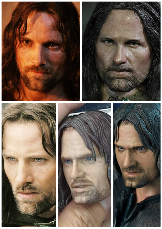
To me the shape of the face seems pretty good. Cheeks could maybe be a little more gaunt. His upper eyelids are pretty consistent in that they have an arc to them versus being square. The nose though to me could use the most work. I think if the nose were right it would add a lot of likeness to the sculpt. In the picture I posted the nostrils are wider. If you would draw a straight line up from the edges of the nostrils the line would be into the eyes. In your picture the nostrils are in line with the corners of the eyes. The part between the nostrils (columella) is more pronounced. In every picture you ever see of Viggo that part always stands out. The bridge could be thicker as well.
 
Here's a handy comparison of the Slim version sculpt and the two new attempts. The newest sculpt still has cheek bones that are not sharp enough and the cheeks are still puffy. It doesn't really look drastically different to the previous version to me. I still feel like the Slim version is the best out of them all but the nose is too small and not wide enough on that version.

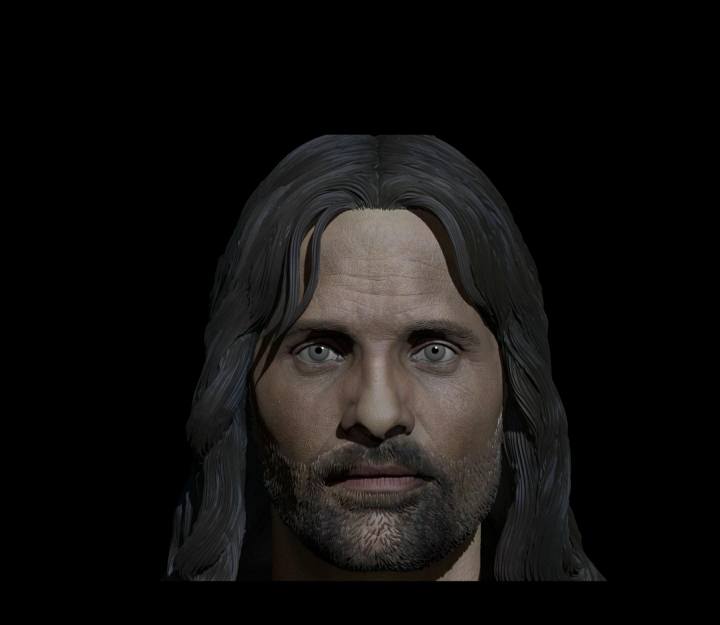
I'm really confused as to why the digital sculpt you showed ages ago wasn't tweaked into the determined face for this release. It wasn't 100% but I feel the proportions were a bit more accurate on it. Would it not be easier to do this figure digitally at this point rather than trying it by hand?

Regardless I'll be picking it up but would love this to be the definitive Viggo sculpt!
edbb86139b33eb2642a6e8d83c1cac5c.jpg
20da861cce7996f653c32430ac71992d.jpg
fcbcc0118c3fda5a19837148e47e668d.jpg


Sent from my SM-G965F using Tapatalk
 
Back
Top