You are using an out of date browser. It may not display this or other websites correctly.
You should upgrade or use an alternative browser.
You should upgrade or use an alternative browser.
Hot Toys – MMS132 - Iron Man 2: Mark VI full spec and pics
- Thread starter Devil_666
- Start date

Help Support Collector Freaks Forum:
This site may earn a commission from merchant affiliate
links, including eBay, Amazon, and others.
dedguy
Super Freak
- Joined
- Sep 21, 2007
- Messages
- 6,448
- Reaction score
- 6
They are diferent figures!!!, I can see from the torso and up they are diferent, just head, arms and legs looks the same.
Well the paint jobs are clearly totally different (like the Mark II and III) but pretty much the whole chest including the traps (muscles next to the neck) are new. The plates that cover the hands/wrist are also new construction in order to allow for the laser pods. As has been pointed out the head is also a different sculpt… or at least the face plate is.
Basically they made everything new that needed to be new not leaving anything because it was "close enough".
hey man, can you put the shopped VI (with the gold biceps) photoshopped next to the way it really is....
I really like your idea with the silver elbows and think that would have been better but would also like to see same pose side-by-side with the unedited VI
thanks!
I really like your idea with the silver elbows and think that would have been better but would also like to see same pose side-by-side with the unedited VI
thanks!
face on would be best, just to compare the look of the new paint job to the actual paint job

$14.99
DC Comics, 12-Inch Superman Action Figure, Collectible Kids Toys for Boys and Girls
Bopster USA Inc
nice, kinda figured you would do both 
I honestly like both although the silver elbows tends to go along with the silver knees better IMO
But then again, the all gold upper arm looks off since the bicep is separated from the rest...maybe if the bicep was left silver but the elbow was silver too, kinda like the silver knee with the silver bit on the thigh
if you dont want to edit it anymore thats cool but if you do, try silver bicep with silver elbow
I agree about the gold, just with the bicep wasn't sectioned from the rest of the arm though if they were solid gold, or if they remained section, it could be more subtle like with the thighs.
I kinda like that too now...
It'll be interesting to see what direction they go with future Marks in the movies.
Thanks for the pics!
What light/camera set up are you using? I always have trouble shooting these figures since they are so shiny and metallic, the lights always reflect or glare poorly because of it...
It'll be interesting to see what direction they go with future Marks in the movies.
Thanks for the pics!
What light/camera set up are you using? I always have trouble shooting these figures since they are so shiny and metallic, the lights always reflect or glare poorly because of it...
dedguy
Super Freak
- Joined
- Sep 21, 2007
- Messages
- 6,448
- Reaction score
- 6
When I was using the p&s Canon Powershot I used to use I would either reflect the halogen lamps I use off white card stock or put something between the light and the subject to diffuse the light (such as a paper towel).
Now I use a Canon DSLR with a fairly cheap [ame=https://www.amazon.com/Canon-50mm-1-8-Camera-Lens/dp/B00007E7JU/ref=sr_1_2?ie=UTF8&qid=1303073860&sr=8-2]50mm Prime lens[/ame] that in conjunction with extension tubes allows for very close macro photography as well such as this head shot:
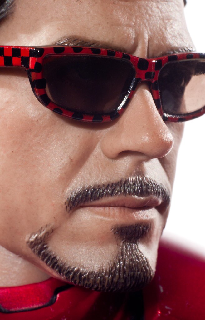
With the DSLR I don't need to diffuse to the light avoid totally blown out specular highlights. I sometimes do anyway just for softer lighting though. If you're having trouble with blow out highlights try deflecting or diffusing your light source. This Mark III shot was done with that cheap Powershot I mentioned above.
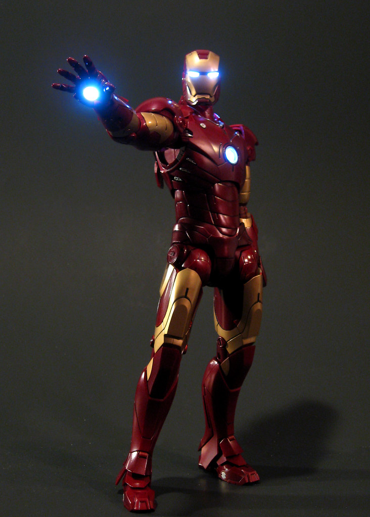
Now I use a Canon DSLR with a fairly cheap [ame=https://www.amazon.com/Canon-50mm-1-8-Camera-Lens/dp/B00007E7JU/ref=sr_1_2?ie=UTF8&qid=1303073860&sr=8-2]50mm Prime lens[/ame] that in conjunction with extension tubes allows for very close macro photography as well such as this head shot:

With the DSLR I don't need to diffuse to the light avoid totally blown out specular highlights. I sometimes do anyway just for softer lighting though. If you're having trouble with blow out highlights try deflecting or diffusing your light source. This Mark III shot was done with that cheap Powershot I mentioned above.

what about the "flare" from the chest RT? my WM always has issues unless I shoot him from an angle because the LED is SOO bright
dedguy
Super Freak
- Joined
- Sep 21, 2007
- Messages
- 6,448
- Reaction score
- 6
That's hard to deal with, as you can see on that Mark III shot they're pretty blown out. The best you can do is use a lot of bright lights when lighting to compensate for the brightness of the leds.
If you're talking actual lens flare there's not much you can do about that with a point and shoot. The best way to fix it is just to have a lens with better glass but I do believe for SLRs you can also get lens filters that dull or fix that effect.
I usually don't have that problem and actually go to great lengths to get lens flares like covering the lens with saran wrap to be able to achieve things like this.
https://www.flickr.com/photos/dedguy/4245574465/in/photostream/
Nice pics.  Decent poses.
Best standing pose I've seen yet:

 Decent poses.
Best standing pose I've seen yet:

That's nice. A lot of power conveyed there.
I like the "striding" pose because of the sense of weight it conveys.
Pretty impressive for a piece of plastic.

I like the "striding" pose because of the sense of weight it conveys.
Pretty impressive for a piece of plastic.

Nice pics.Decent poses.
Best standing pose I've seen yet:

looks drunk and staggering
That's a touch unbalanced for my tastes. I like really centered planted poses. I was really happy with this pose.
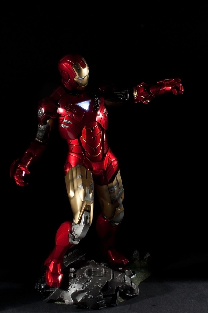
very dynamic
That's nice. A lot of power conveyed there.
I like the "striding" pose because of the sense of weight it conveys.
Pretty impressive for a piece of plastic.

love the "backward flight" pose!
Mech test...which is kinds dumb imo
Similar threads
- Replies
- 92
- Views
- 11K
- Replies
- 107
- Views
- 10K
- Replies
- 13
- Views
- 1K
- Replies
- 18
- Views
- 1K


