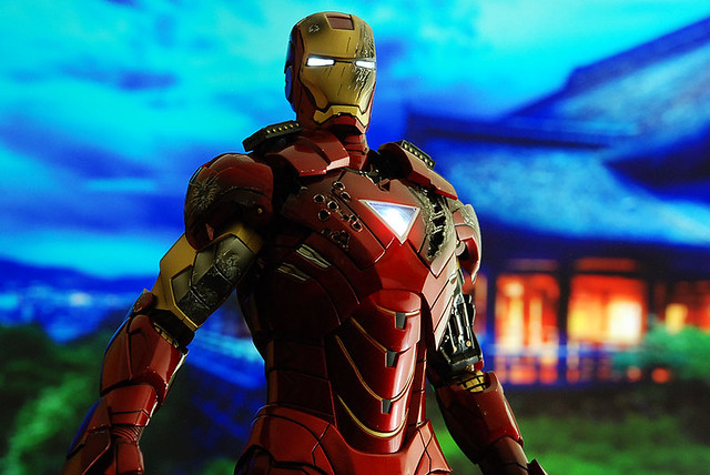
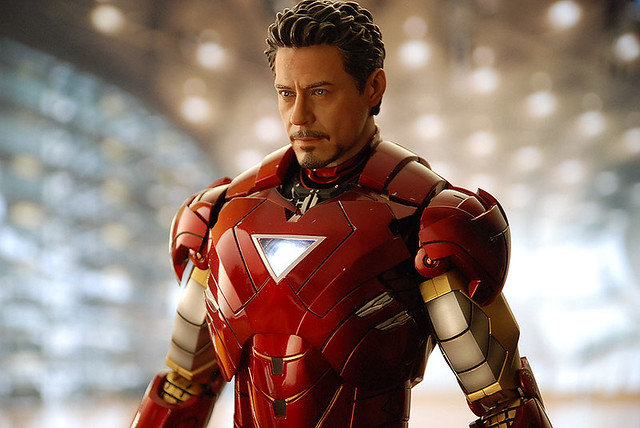
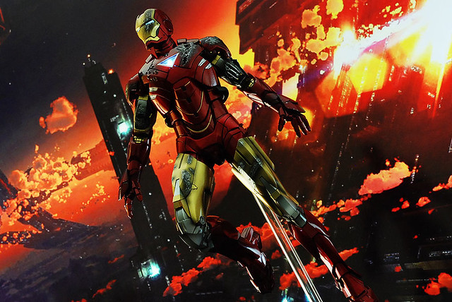
Hot Toys – MMS132 - Iron Man 2: Mark VI full spec and pics

Collector Freaks Forum

Help Support Collector Freaks Forum:

This site may earn a commission from merchant affiliate links, including eBay, Amazon, and others.
Its the price of details. I was looking at it last night and it appears to me to be a little silver cylinder detail on the body that keeps the metal popping up.


I will say at first I was pretty indifferent about the grey additions on the suit but in hand I think it looks amazing. Adds a touch more visual interest to the overall figure.
 
Finished up brief second part of my review of the figure found here.

I'm glad I got it with the exception of the battle damaged alignment problem.

The battle damaged parts look fantastic and was the biggest draw for me since I already had the Mark IV. Now the wait begins for the Mark V...which is just around the corner.

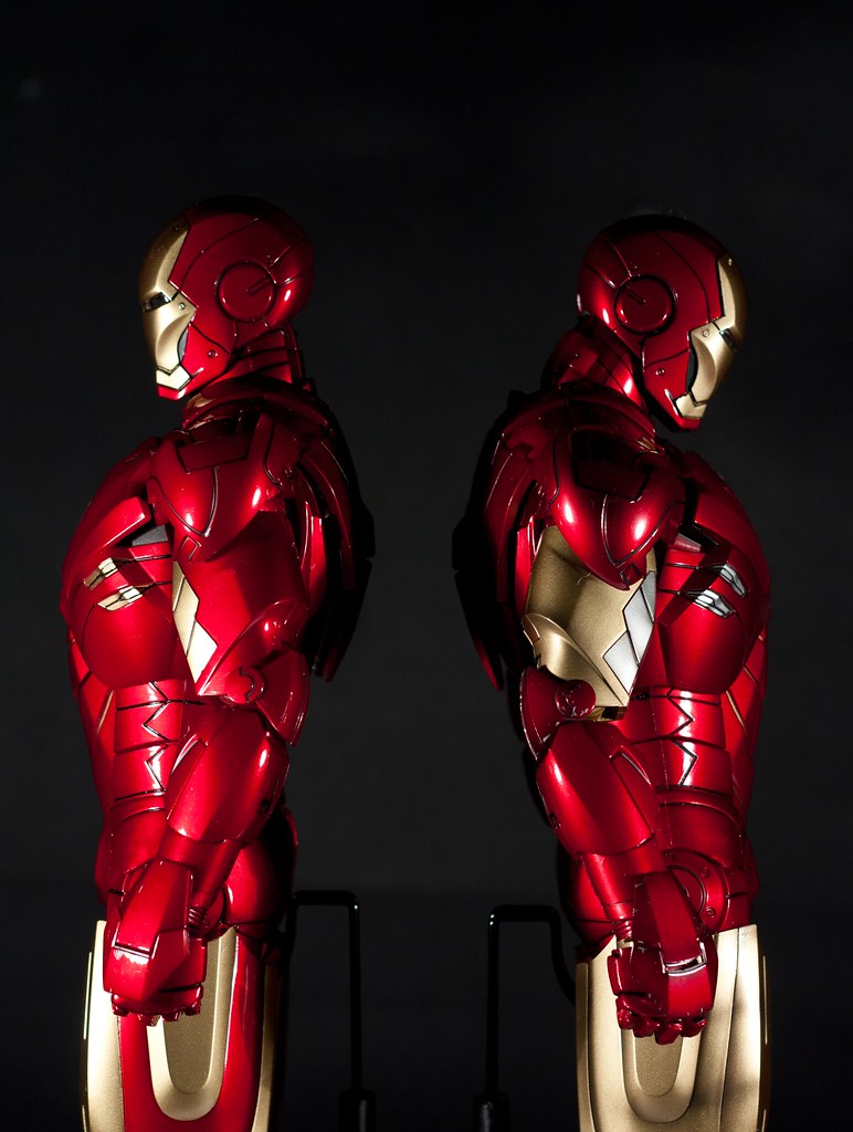
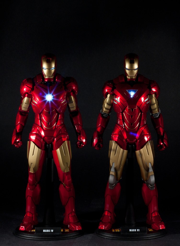
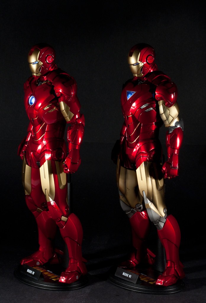
5625776751_55354bf2fc_z.jpg


5626365298_dc7af0fdd7_z.jpg


5625776795_6559004c99_z.jpg


As always great review Otaku & your pictures came out stunning :clap
 
Its the price of details. I was looking at it last night and it appears to me to be a little silver cylinder detail on the body that keeps the metal popping up.


I will say at first I was pretty indifferent about the grey additions on the suit but in hand I think it looks amazing. Adds a touch more visual interest to the overall figure.

Yeah I have warmed up to the gray, I never had a huge issue with the gray on the knees. Actually like it, just never liked it on the biceps and still feel it looks a bit wonky. I think I would have preferred the elbows pads and the inside of the elbows yo be silver and the upper arm to be totally gold. I think that still would have given enough balance.

Overall though the Mark VI I think just looks better largely because of the all gold thighs. The Mark III-style paint on the thighs of the Mark IV while doesn't look bad, doesn't look as good to me as the all gold on the VI.
 
Man, I'm seriously considering cutting the ball joint out the torso on my Mark VI and IV. The is almost never actually seated on it anyway. Will allow better range of movement for the neck and also have it sit lower in the body a bit which will make it look more screen accurate.

Are you talking about the neck or torso joint? Dont do anything drastic that cannot be reversed :p. Of its the neck you want then just pop open the neck itself and remove the rubber socket and it should have a similar result without the irreversible removal of the joint itself


:borg:
 
No, the ball joint inside the body. I have no problem with irreversible mods. My Hot Toys Predator is heavily modified almost all of them totally irreversible. I'm in the 1/6 hobby for it's customizing aspect :)

I think lowing the head on the neck will actually reduce articulation and won't look as good as lowering the neck into the body.

Oh and this is a quick mockup of the color changes I mentioned. Not something I'll ever do as a custom. I will probably 'shop some photos I take though with this color scheme.

Hot-Toys-Iron-Man-VI-mock-color.png
 
Yeah I was like still lower? Cause I thought they got the neck right this time. But your post was a lil confusing mentioning the torso but also the movement of the neck so I chose the lessor evil :lol
So you want more movement of the torso not lowering it? I am still confused :D
Btw the mod I suggested is for the neck to sit deeper in the body. It's what I did for MIII BD and TdK DX02

:borg:
 
Oh I totally didn't get what you meant, sorry misread and thought you where talking about removing the socket inside the head (which some people have done). I want to remove the ball joint since it will allow the neck to move laterally in the body and the neck fits well enough in the socket, especially with the rubber neck collar, that the ball joint is largely unnecessary.

Like this pose is totally impossible with the neck connected to the ball joint and the head pose would look better if the ball joint wasn't even there.
 
Ohhhhhh so it is the neck that is bothering you but just not for it's length but posebility. Removing the socket will give it a but more freedom but not sure if it's enough but might as well give it a try. Also since the joint is now hinged I would think it helps as well, you did see that?

:borg:
 
Yeah it's only hinged to move forward and backward, not laterally. Which natural head movement your head tends to tilt more at the base of the skull in forward/back movement and mostly at the shoulders for side to side. So the forward/back movement on the torso joint largely results in awkward looking head poses, partially with the neck all the way back.
 
Yeah I have not really toyed with mine yet so not sure what the resulting poses would be but assume it is to allow the head to up more for pinching or flying pose. But yeah won't really help in your case.
At least hack up the neck which you could replace much easier :p if that gives you the result you are looking for :p
Btw since the ball joint is hinged maybe you can remove it without destroying it ;)


:borg:
 
Yeah I'm trying to figure out if I can remove it without hurting anything. I don't mine changing a figure irreparably but will try other things first if I can.

Here's an example of what I mean in natural vs unnatural. The Mark VI's neck isn't seated on the ball joint which is why it's higher than it should be and why I want to remove the joint. The IV has the neck pushed back as far as it can go for contrast but pushed forward it doesn't look that different.

5627762913_8d1030b50e_b.jpg
 
A few further notes on posture.

Until I got the Mark VI I had been posing my Mark IV like you see on the left. The shoulders raised up as far as they could go with the torso hunched forward. I did this largely because this was the best look for the Mark III due to it's limited articulation. When I got the Mark VI though it came packaged with the shoulders down as low as possible as well as the body tilted back as far as possible. This made me realize that was by far the better look for the VI/IV.

When the shoulders are pushed down as far as they can go it does much better at that sloped shoulder look all the Iron Man suits have. When you sort of hunch the torso forward it also robs the torso of a lot of that feeling of mass since the abdominal plates compress inwards. So for the "museum" pose I have taken to posing both my Mark IV and VI in the pose the VI is in on the right.

I think the posture of the Mark VI clearly looks better.

5628654674_9d987fa778_b.jpg
5628068617_51216cbcce_b.jpg

Interesting concepts on the poses and very good pictures dedguy :clap

Think I'm going to go mess around with poses while I watch the hockey game :wave
 
:lecture Love the comparison shots.

How about a posture where the shoulders are up, but trunk is up as tall as possible....I think that might look cool for this pose.
 
They are diferent figures!!!, I can see from the torso and up they are diferent, just head, arms and legs looks the same. :)
 
Back
Top