Hot Toys - MMS143 - Spider-Man 3 official specs and pics

Collector Freaks Forum

Help Support Collector Freaks Forum:

This site may earn a commission from merchant affiliate links, including eBay, Amazon, and others.
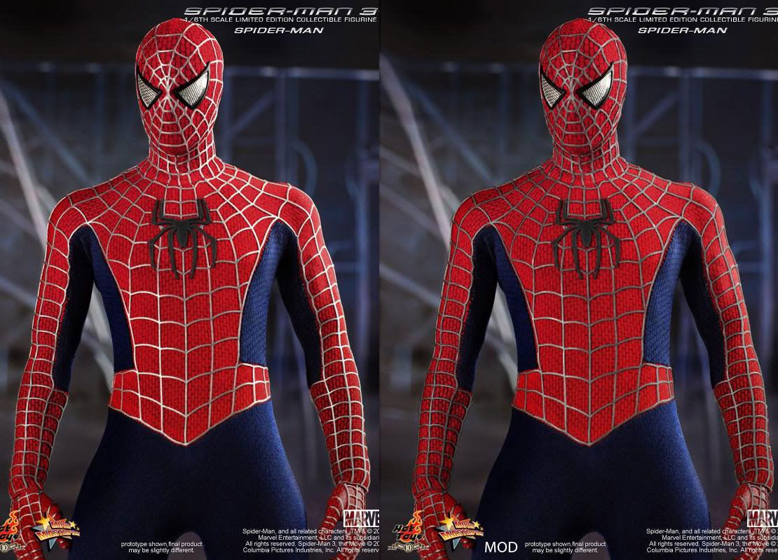
To make the perfect 1/6 Spider-Man, HT should...

1. Make the webbing a little darker.
2. Make the webbing thinner.
3. Tone down the color red.
4. Make the ankles pose able.

Am I missing anything?

This is just my opinion and I'm not complaining. I just want us to have the perfect spidey in our collection so don't hate me please. :)
 
I have never been one to b_____h and gripe about HT releases

I am usually 100% satisfied with the promo pictures and usually nit pickers make me :mad:

With this one it has to be said they have got some major details wrong and I am really hoping they read this board and resolve :pray:
 
154319_466373197343_58690437343_6039728_6179539_n.jpg


Those boots really do not look good. :gah:

The fact that he has no ankle articulation makes this look really awkward. Normally the ankles would be bent and the soles of the feet flat against the webline.
 
Boots are definately an odd choice...Symbol looks small and shouldn't it be the same color as the webbing instead of just BLACK?
 
154319_466373197343_58690437343_6039728_6179539_n.jpg


Those boots really do not look good. :gah:

The fact that he has no ankle articulation makes this look really awkward. Normally the ankles would be bent and the soles of the feet flat against the webline.

:lecture

Look at them hands also :gah:

Think Arnie's face below says it all
 
Last edited:
The hands look exactly like the Medicom ones. I don't think you go with gloves here, but those look off. Not sure what to do about the boots. Spandex or fabric of some kind?
 
whats with the "its a crappy fig and I dont like it, but Im still gonna buy it anyways" attitude with this particular thread? :dunno

I mean yeah, it does have its minor flaws, but so do the P1 (shorter), wolvie (not having enough jackman likeness), blade (not having enough snipes likeness), joker dx (wrong lining color on jacket) and etc. But these figure still do extremely well and command a premium price now.
 
I'll take it. I just wonder will HT be pursuing Spiderman 1&2 considering the reboot will soon be all the rage. Spiderman 3 may have been a bit of a letdown but even so, for me, as of this moment, Maguire's Spiderman is where its at. Despite the fact that, to me, any changes in the costume were very minor, I'd still like a Spidey 2 version at least - it'd vindicate the decision I have to make to not buy more than one of this figure here. Why would I want more than one Spiderman? - to have more than one cool pose on the go at one time.

Anyway, I'm not an expert on Spiderman or the precise details of the various suits in the films but this figure looks cool. His build is excellent - much better than the medicom. Seems to me like they've done a good job on the proportions. I wonder how he sizes up next to other figures though - he should be pretty short.
 
The hands look exactly like the Medicom ones. I don't think you go with gloves here, but those look off. Not sure what to do about the boots. Spandex or fabric of some kind?

HT CEO1: Those boots. Let's make them plastic with FLAT soles!

HT CEO2: Surely you must be joking?!

HT CEO1: I'm not joking. And stop calling me Shirley.
 
spiderman3leak01.jpg
35620_466374352343_58690437343_6039759_5876803_n.jpg


The belt area on the fig is way too wide giving him a fatter look. Definately need to gray up the webbing and make the symbol bigger as well as slightly darker than the webbing. Red and blues needs to be toned down.
 
What makes this a SM3 Spidey costume? Wasn't the red and blue suit the same for all three movies?

Not that much different really. It is very minor change between all three films.

From 1 to 2 they made the colours more pronounced and gave him the webbing on his palms, (missing in Spidey 1).

From 2 to 3 the webbing is a darker gray, and raised more from the suit and his eyes have an amber tint now. Again, the colours pop more, (could be the CGI), and the hexagon print is sharper.
 
Last edited:
Looks nice but..looks a bit off to me :monkey4

- The suit texture could be much better
- the lenses should be shinier and the webbing detail in the suit more grayish
- The headsculp is one piece..not removable.. so then not Parker/Maguire sculp?? :monkey1
- The chest spider simbol is'nt very accurate..

Maybe, this would be the best Spiderman 3 figure to date.. but I expected much more from HT .. and I feel a little disappointed..
I´ll wait for black/simbiote Spiderman and of course.. Venom (both confirmed!)

Edit: At least the headsculp is made from fabrics, and not nasty plastic. and the new TT body looks really nice and accurate
 
Last edited:
Wow, just getting to this now. Overall it looks great. Body proportions are great and the suit is very impressive for 1/6 scale.

I imagine all my constructive comments have already been noticed by other people.

1. lenses need to be shinier
2. not a fan of the boots being hard plastic and not moveable
3. the spider sticks out too much, not sure if it needs to be lighter.
4. the webbing needs to be on the edge of where the red meets the blue. Right now you can see a bit of red poking through.
5. they need to include something that allows him to be posed in the air - something like the Tony Stark figure.
 
Back
Top