minivader
Super Freak
not really feeling this one. something just seems very cheap by HT standard.


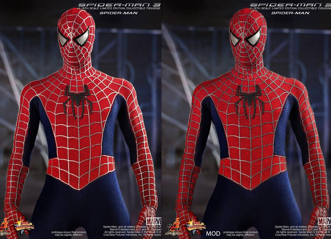
The belt area on the fig is way too wide giving him a fatter look. Definately need to gray up the webbing and make the symbol bigger as well as slightly darker than the webbing. Red and blues needs to be toned down.
I think that would go a long, long way in curbing the "man in pajamas" look he's got going. Significantly minimizing the grey webbing would help make it look classier as well; if it can't be made thinner due to 1:6 scale, it could at least be darker. Making the spider on his chest more accurate and reflective would also raise the quality of the figure considerably.The real oversight of the figure is the lack of a screen printed muscular texture that the use has... with is doable!
See the darkening of the suit's textile about the abs?
In the special features the costume designer speaks about how they did it.
For me, it is because this is Spiderman, and like with Wolvie, HT is giving us the best available version of this iconic character in this scale, so that's what I'm gonna get until something better comes along. I suspect that others feel the same, which explains the popularity of, say, HT Wolverine.whats with the "its a crappy fig and I dont like it, but Im still gonna buy it anyways" attitude with this particular thread?
I mean yeah, it does have its minor flaws, but so do the P1 (shorter), wolvie (not having enough jackman likeness), blade (not having enough snipes likeness), joker dx (wrong lining color on jacket) and etc. But these figure still do extremely well and command a premium price now.
This minor change makes a huge difference, IMO, and makes the figure much much better. The web lines, as they are, lack the subtlety that made the gray lines on the movie version tolerable, IMO. Yes, you notice the gray webbing on the movie version, but it isn't in your face like it is with this figure. Do this and give him cloth boots, and I'll be very satisfied.shop

For shame. MJ wouldn't be satisfied with a sub-par Spidey.I love it!!!
I'm out of here until more info is available... all the whining is really sad...


The look solid and plastic, like Medicom's. Spidey is, by his nature, a character you want to be able to pose in all kinds of funky positions. Plus, they stand out from the rest of his outfit. Makes him look like he dressed up in some nice pajamas then wore some painted-up shrimp boots over his feet.So what's every one's gripe with the boots? Is there worry that they will limit articulation? They look screen accurate to me.

I guess after all these years people still don't get the:
"Prototype shown, final product may be slightly different"
caption on every HT preview...

The look solid and plastic, like Medicom's. Spidey is, by his nature, a character you want to be able to pose in all kinds of funky positions. Plus, they stand out from the rest of his outfit. Makes him look like he dressed up in some nice pajamas then wore some painted-up shrimp boots over his feet.


Enter your email address to join: