Wow that’s a fantastic custom that screams Vader
You are using an out of date browser. It may not display this or other websites correctly.
You should upgrade or use an alternative browser.
You should upgrade or use an alternative browser.
1/6 1/6 Hot Toys - MMS 452 - Star Wars: Episode V ESB - Darth Vader
- Thread starter MoMo
- Start date

Help Support Collector Freaks Forum:
This site may earn a commission from merchant affiliate
links, including eBay, Amazon, and others.
GodParticle
Super Freak
- Joined
- Jul 30, 2013
- Messages
- 1,296
- Reaction score
- 183
Should just junk the HT ESB and keep the ESB custom haha. The dome looks enormous on HT ESB
bebe13junior
Super Freak
- Joined
- Jul 30, 2014
- Messages
- 3,362
- Reaction score
- 630
RO!
Wow that is an impressive figure.
Sent from my iPhone using Tapatalk
ajp4mgs
Super Freak
- Joined
- Jul 10, 2017
- Messages
- 2,305
- Reaction score
- 1,672
This is the comparison I was hoping to be able to see. Thank you for posting this!
When I scroll your photo so that the helmets are off the screen, the HT Vader actually looks quite good. But then when I scroll back up and see the difference in the helmets . . .
 That HT ESB mouth is something I just can't get over.
Still love that custom. Continues to look great!
Looking great. The helmet on the ESB Vader always seems to sit a bit too low, whereas the RO and ANH Vaders either side in Matrix's pic have the helmets sitting more clear of the shoulders.
I think it's the angle/orientation of the dome that makes it seem that way. The mask itself looks to be resting properly over the shoulder armor. In fact, if anything, there might be more space than needed between the bottom of the neck and the top of the chest box.
I'm surprised that nobody has tried to do something to either swap domes, or re-orient the ESB one so that it doesn't angle so far down at the back.

$14.99
DC Comics, 12-Inch Superman Action Figure, Collectible Kids Toys for Boys and Girls
Bopster USA Inc
This is the comparison I was hoping to be able to see. Thank you for posting this!
When I scroll your photo so that the helmets are off the screen, the HT Vader actually looks quite good. But then when I scroll back up and see the difference in the helmets . . .That HT ESB mouth is something I just can't get over.
Still love that custom. Continues to look great!
Once the lil' button nose is fixed on the HT ESB facemask, the whole helmet comes together for me. It is quite rightly getting a lot of flack due to the "big mouth" issue (as well as the break in the tusk rails, downward pointing tusks, reveal brace greeblies being visible etc etc) but with the nose fixed and mods done, I actually think it's the best of the HT helmets side by side with the HT ANH/RO sculpt.
I still do think the Huricane/Kaiyodo route yields the most accurate look - I also have a HT ESB Vader as well as a custom Hurricane/Kaiyodo Vader, and I do think the custom helmet looks a bit better, even if the finish is better on the HT helmet.
I think it's the angle/orientation of the dome that makes it seem that way. The mask itself looks to be resting properly over the shoulder armor. In fact, if anything, there might be more space than needed between the bottom of the neck and the top of the chest box.
I'm surprised that nobody has tried to do something to either swap domes, or re-orient the ESB one so that it doesn't angle so far down at the back.
I think it might be that the ESB cape is pretty thick due to the layered fabrics and this "lifts" the shoulders a few more mm than the others. The RO cape is more like a stretchable lyrca material with a single layer so it not only thinner, it stretches slightly (its a VERY heavy fabric) which slightly thins it even more over the shoulder armor. Though I think the ANH cape is double fabric also - I never had that in-hand.
The HT ESB Vader always looks like the helmet needs to be raised by a few mm to me to compensate for the thicker cape.
I know everyone loves the Kaiyodo, but the fact the mouth is lopsided in the wrong direction still bugs me too much. The R1 got it a lot closer I think.
rayeknor
Super Freak
- Joined
- Jan 24, 2015
- Messages
- 1,138
- Reaction score
- 572
R1 imo has the most accurate mouth size. Overall I prefer the HT esb, for all the details being there, finish and overall quality. Tho you can see the to me much inferior SS deluxe got a partial head reveal done without the tusk rail gaps. I still think they put those there on purpose as a nod to the suit up scene in episode III. Howard is a big prequel fan.
Thanks for posting the lineup
Thanks for posting the lineup
I'll have to get the ruler out and measure them.Looking great. What are the respective heights on your four Vaders, Matrix?
The helmet on the ESB Vader always seems to sit a bit too low, whereas the RO and ANH Vaders either side in Matrix's pic have the helmets sitting more clear of the shoulders.
Nice Matrix! Excellent customs!
Thanks guysWow that’s a fantastic custom that screams Vader

I'll be customizing the HT version..Should just junk the HT ESB and keep the ESB custom haha. The dome looks enormous on HT ESB
Kaiyodo/SS deluxe mask,Kaiyodo shoulder/boot armor and boots,Hasbro titanium helmet,SS ANH suit,SS DELUXE chest box,belt/boxes and hilt,custom gloves and Rayon cape and tunic....and they're back
That custom esb Vader is amazing tho. What's the recipe?
This is the comparison I was hoping to be able to see. Thank you for posting this!
When I scroll your photo so that the helmets are off the screen, the HT Vader actually looks quite good. But then when I scroll back up and see the difference in the helmets . . .That HT ESB mouth is something I just can't get over.
Still love that custom. Continues to look great!
I think it's the angle/orientation of the dome that makes it seem that way. The mask itself looks to be resting properly over the shoulder armor. In fact, if anything, there might be more space than needed between the bottom of the neck and the top of the chest box.
I'm surprised that nobody has tried to do something to either swap domes, or re-orient the ESB one so that it doesn't angle so far down at the back.
The Empire mask is all kinds of wrong...tusks,mouth grill slope,cheek shape,eye shape,dept of eyes lens,small nose,short neck etc....it's all a complete mess and a disappointing step backwards from the ANH/R1 versions...which have issues too but are still more accurate.
generalgrevious
Super Freak
I have the hurricane mask which I`m using on the HT ESB version.
I agree that the HT ESB Vader helmet is a disappointment overall - I'm still planning to see if I can fix stuff like the angle of the "teeth," the hideous gap/step in the tusk rail and the visible-from-the-front "reveal" greeblies (just lazy on HT's part) as well as sanding the two facemask "halves" to get them to sit closer together - but with a few mods it still can display pretty nicely. The slightly off cheek sculpts I'm just going to have to be okay with.
It does have some positives - for example they fixed the awful mesh pattern (behind teeth) the RO/ANH sculpt has, got rid of the slight "points" on the sides of the nose surround, and they didn't do yet another "plug" nose - for these, we should be thankful. Overall, I like it better than the RO/ANH sculpt, though I haven't yet done all my many mods on that sculpt yet, so I guess I'm getting ahead of myself.
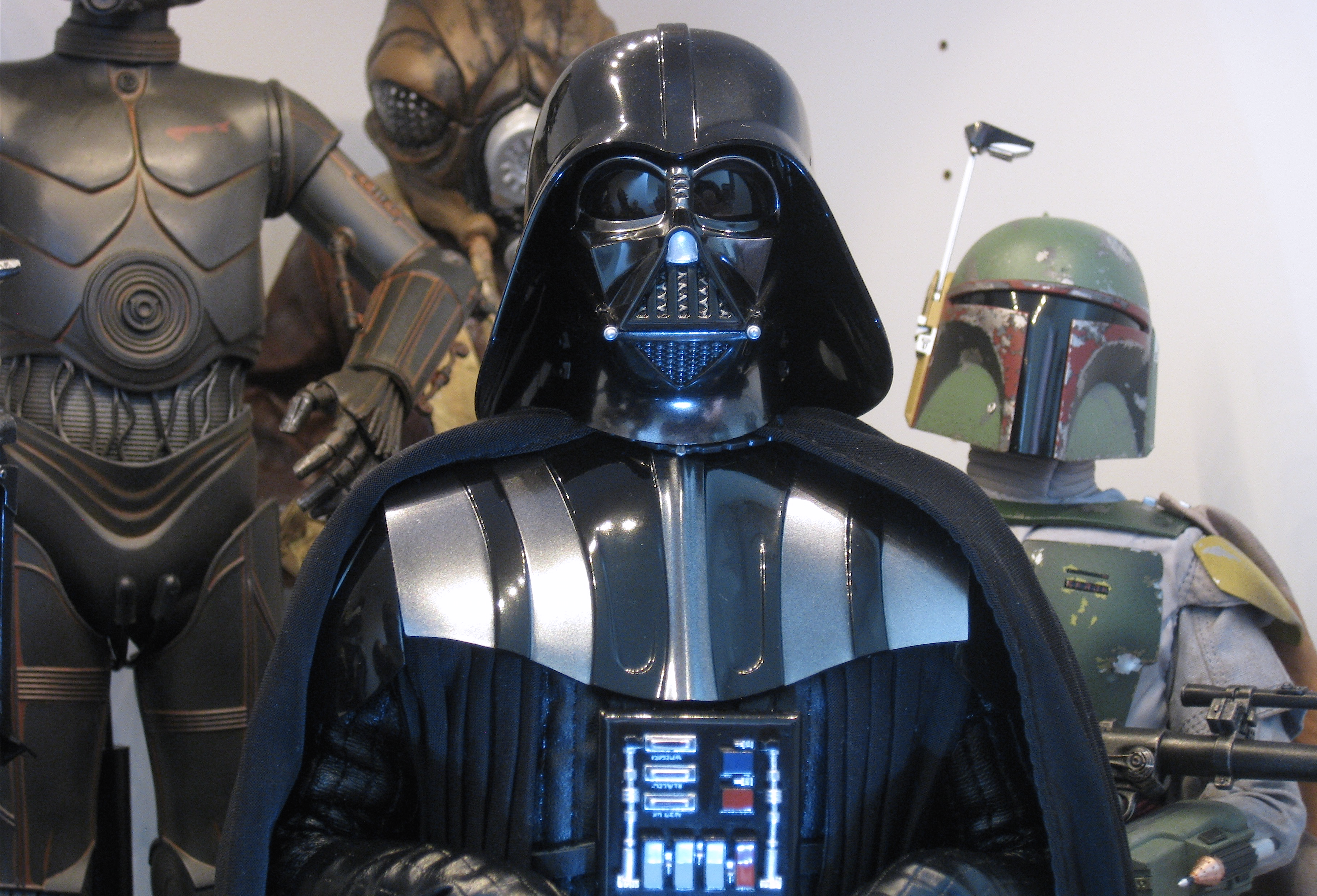
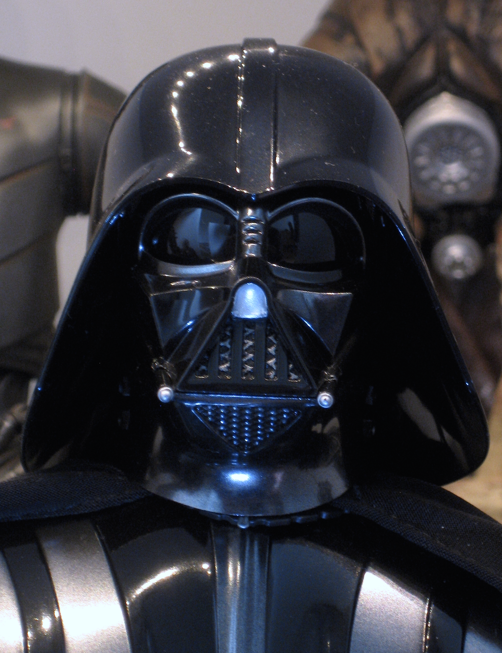
 Thanks so much for these comp pics you do.
It does have some positives - for example they fixed the awful mesh pattern (behind teeth) the RO/ANH sculpt has, got rid of the slight "points" on the sides of the nose surround, and they didn't do yet another "plug" nose - for these, we should be thankful.
 Overall, I like it better than the RO/ANH sculpt, though I haven't yet done all my many mods on that sculpt yet, so I guess I'm getting ahead of myself.

 Thanks so much for these comp pics you do.
GodParticle
Super Freak
- Joined
- Jul 30, 2013
- Messages
- 1,296
- Reaction score
- 183
My thought was to sand down the top half where it joins the bottom. Shouldn't be super hard to do and might make it look less long in the front
My thought was to sand down the top half where it joins the bottom. Shouldn't be super hard to do and might make it look less long in the front
Yeah, I'm planning to do the same, so it narrows the chin gap so the mouth triangle size reduces further.
You kinda forget just how many mods it takes to get the RO/ANH facemask to look good - this one may have more.

juzcruisen
Freakzoid
- Joined
- Jun 7, 2012
- Messages
- 81
- Reaction score
- 1
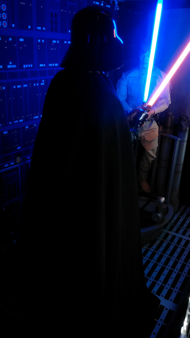
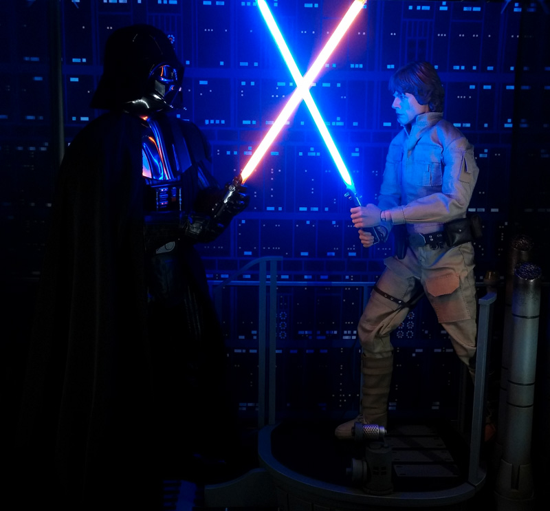
Like this Vader...does the job.
Lord Valefor
Super Freak
Is it possible to still get one of these Kaiyodo masks? what does the box it comes in look like?
canofhumdingers
Super Freak
- Joined
- Mar 10, 2010
- Messages
- 427
- Reaction score
- 16
I’m too lazy to multi quote all the things but I felt like making a few comments.
It’s not just the mouth slant that’s backwards on the kaiyodo mask. The whole mask is a mirror image of the real deal (the cheeks being an obvious example).
The deluxe Sideshow doesn’t have the reveal gap in the tusk tubes because they eliminated the entire front portion of the top tube and it looks awful.
I don’t know what some of y’all are on about the shape of the HT ESB cheeks and eyes being off? They look fine to me. While different, they’re not any more off than the ANH/R1 mask. And in some ways I think they’re better. (See below a comparison to an Efx full size mask, and I’m pretty sure the HT mask below has had the tusks and nose modded, but since we’re talking about cheeks and eyes here that shouldn’t matter)
As for the mouth, when properly lit, it’s really not nearly as wrong as many photos make it appear. I think the ROTJ style fat bottom lip combined with the tusk position really throw off some photos, but in hand (or with favorable lighting conditions) it’s not nearly as bad as some people say.

juzcruisen
Freakzoid
- Joined
- Jun 7, 2012
- Messages
- 81
- Reaction score
- 1
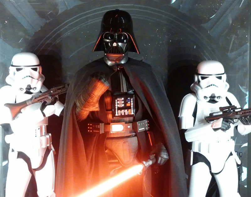
Work with this one, and bellyache.
mattinglymint23
Super Freak
- Joined
- May 19, 2015
- Messages
- 1,241
- Reaction score
- 9
He's holding Luke's saber like in the close up of Vader examining it. This guy may have been second unit doing pick up shots.
So that 20k I spent on Prowse autos was a bust?
Sent from my iPhone using Tapatalk
Similar threads
- Replies
- 104
- Views
- 7K
- Replies
- 245
- Views
- 23K
- Replies
- 140
- Views
- 6K
- Replies
- 94
- Views
- 9K
Latest posts
-
-
-
-
AUGTOYS - 1/6 Dune Action Figures (Licensed)
- Latest: OmarColeccionador
-
-
1/6 Hot Toys - The Flash - Supergirl Collectible Figure
- Latest: Darth Snoopy


