1/6 1/6 Hot Toys - MMS 452 - Star Wars: Episode V ESB - Darth Vader

Collector Freaks Forum

Help Support Collector Freaks Forum:

This site may earn a commission from merchant affiliate links, including eBay, Amazon, and others.
Yeah that does look a lot better, and somehow makes the mask seem not quite as long too. Although it also feels to me like the dome doesn't sit forward as much as it should. And you can see it in your profile comparison as well.
It might need a tad more tweaking but those profile pics are at different angles...here's a better comparison...
View attachment 430506
Yeah, agreed. It's one of the issues with the way the dome attaches is there's really no way to tweak where it sits other than spin. I'll maybe futz with that to see if I can get it to move forward a touch. It's one of the things that gives it a bit of a "flat face" look in profile.

As I mentioned earlier, the other issue with raising the dome as well as the helmet overall is it pushes this Vader back up into that 14" height range the RO version has. It was one of the pluses of the HT ESB Vader - that it was a notch or two shorter than the ANH and RO versions.

The 13 1/4" height of Matrix's custom feels much more accurate to me, but I guess it doesn't matter if you display Vader as a standalone.

Can't you achieve that look by re-angling the helmet, not raising it but pulling the back more outward... in other words, tipping the helmet as a whole more forward? That shouldn't change the height at all.
Yes it's only the back of the helmet that needs raising/re-angling...the overall height of the figure still remains the same.
Here's my modded dome. Shaved a little bit off of the rubber insert and moved it back some so the helmet sits lower and more forward. It can still be positioned to show a little more brow if i wanted.

View attachment 430435

View attachment 430437
That looks great!...more or less the same route that i took.
 
Here's my modded dome. Shaved a little bit off of the rubber insert and moved it back some so the helmet sits lower and more forward. It can still be positioned to show a little more brow if i wanted.

View attachment 430435

Did you also remove nearly all of that "peg" that's behind the rubber part seating? I'm considering removing all of it. Seems like it holds the helmet back even if you move the rubber part.

Also, why did you dremel out the back edge of the rubber part's housing? Can't you just trim the rubber (and lengthen the rubber part's slots that fit on the small keyhole pegs) and slide it back within the existing housing square?

TESB chest armor with R1 shoulder bells...better scaled.
View attachment 430514

Comparison..i still can't understand why they didn't reuse the R1 armor...maybe they will on the ROTJ version:)View attachment 430515

Good catch. I have an extra set of RO chest armor in my parts box and will try this. The one issue is that rubbery linking "tape" HT uses is usually really hard to peel.
 
That looks great!...more or less the same route that i took.

Thanks 🙏🏽The shoulder bell switch looks great. Might try that as well if I can get parted out chest armor.


Did you also remove nearly all of that "peg" that's behind the rubber part seating? I'm considering removing all of it. Seems like it holds the helmet back even if you move the rubber part.

Also, why did you dremel out the back edge of the rubber part's housing? Can't you just trim the rubber (and lengthen the rubber part's slots that fit on the small keyhole pegs) and slide it back within the existing housing square?

Yeah I kept clipping away at it while placing the dome on to see how much forward I wanted it to sit. I wanted to leave something there to help the dome sit properly without relying on just the peg. Give it a lil more stability. For the rubber piece I probably could have just trimmed it to fit but I didn’t want to mess up those 2 notches that key-in the rubber grommet. It’s glued in either way so I might have been able to just trim it. Maybe I over thought it hehe.
 
Here's my modded dome. Shaved a little bit off of the rubber insert and moved it back some so the helmet sits lower and more forward. It can still be positioned to show a little more brow if i wanted.

View attachment 430435

i did that mod. cutting out the peg behind the rubber socket so the helmet sits back better.

I shaved the peg back so it was just the back flat part left like in the pic (ie scalpeled out the two angled supports on the front side of peg) but sounds like the whole peg needs to be removed. I've moved the rubber part back within the housing but the whole helmet is still not moving forward so I guess it's the back part of the peg that has to go too.
 
I shaved the peg back so it was just the back flat part left like in the pic (ie scalpeled out the two angled supports on the front side of peg) but sounds like the whole peg needs to be removed. I've moved the rubber part back within the housing but the whole helmet is still not moving forward so I guess it's the back part of the peg that has to go too.

Huh hat’s weird. I just removed the angled supports on it and it mover forward a few mm’s. Did you go low enough? As in more flush to the underside of dome so there’s no obstruction.
 
Prowse had a bit more heft to him in Empire...so i added some padding under the front of the jacket...to bulk up the chest and lower torso...
View attachment 430548

Looks great...so you mixed the TESB upper chest armor with R1 chest bells? The chest armor looks kind of shorter more like R1. Even looks to sit slightly higher with some gap between the chest armor and light up feature. How did you manage that if this is TESB chest armor?

Like yourself one of the first things I did was stuff a bit under his shirt...small tears of simple safe cotton balls did the trick.
 
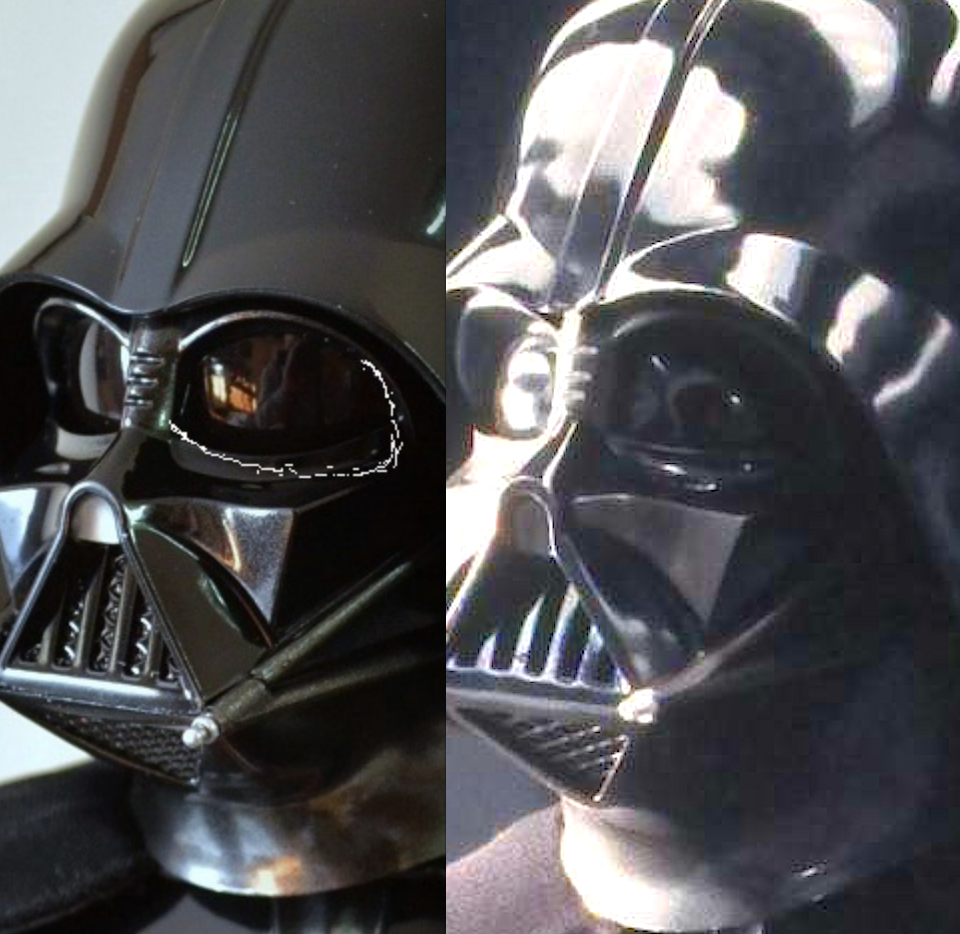
I always thought it was the widows peak and the tusks that were the problem, but this pic shows quite a bit more difference.

the eyes are the main problem for me in every single picture I saw so far. Look at how the bottom eyelid slopes upwards towards the side of the face in the figure instead of downwards in the real helmet. It makes him look "angry" like he's frowning or something and totally ruins the Vader look. I might have been able to tolerate the mouth and tusks if it wasn't for this.

In comparison the RO/ANH figure eyes are a bit too large but better shaped
 
Matrix, I think you need to put some more padding right under the lower portion of the chest box. Its bottom part sits deeper then top part and gives a crunching look illusion. BTW, why didn't you just put all R1 Vader chest-shoulder armor instead of just shoulder pad?
 
here in my crude drawing he already looks a lot more like Vader (eye shape). HT ESBV MODS.jpgHT ESBV MODS (2).jpg
 
sort of closer to how the eyes look in the real mask .that's the point I've been trying to make since the figure came out. I think it's the main reason the whole face looks off

In the figure the eyes look sort of like the Ralph Mcquarrie early drawing of Vader
 
But if you brighten the ref pic the sculpt seems closer though. Its a pretty unclear ref pic though - lot of shadow and reflection.

43608775170_55826d6076_o.png
 
Back
Top