You are using an out of date browser. It may not display this or other websites correctly.
You should upgrade or use an alternative browser.
You should upgrade or use an alternative browser.
1/6 1/6 Hot Toys - MMS 452 - Star Wars: Episode V ESB - Darth Vader
- Thread starter MoMo
- Start date

Help Support Collector Freaks Forum:
This site may earn a commission from merchant affiliate
links, including eBay, Amazon, and others.
canofhumdingers
Super Freak
- Joined
- Mar 10, 2010
- Messages
- 427
- Reaction score
- 16
I don’t know what y’all are on about with the eye shape. The bottom lid DOES curve up at the outer corner on the real deal. Neither of your drawn lines follow the actual shape of the eye... (hard to do when it’s obscured by shadow in the photo).
Lord Valefor, for a guy who couldn’t even tell the difference between the screen used ANH mask and the ESB fencing mask (possibly two of the most different filming masks made), you are VERY picky about the most minute details on these figures. I’m not trying to be mean to you, just trying to offer a little perspective. And really, if you want the most extreme down-to-every-last-detail accurate Vader helmet, I’d strongly suggest you forget figures or statues and look into 1:1 prop replicas. That’s the only way you’ll really get the accuracy you seem to want.
Below are some zoomed in crops of old photos I’ve taken of my 1:1 Efx PCR helmet where the eye shape is more visible than the photo you’re using above. I’ve held this HT Vader up next to it and compared them side to side. The eyes are VERY close in shape to the real thing. Is the HT mask a perfect mini replica? No, it’s not. It’s not 3-D scanned from a real prop, it’s an artist’s sculpt using photos and stuff for reference. But holding it next to a full scale prop that IS sourced from THE original, this sculpt is DARN close (exception given for the tusk angle, obviously). But the rest of the face is very close and the eyes are fine. If I had any complaint about the eyes on this figure, it’s that the lenses might not *quite* be set deep enough in the socket. But we’re talking a fraction of a millimeter.
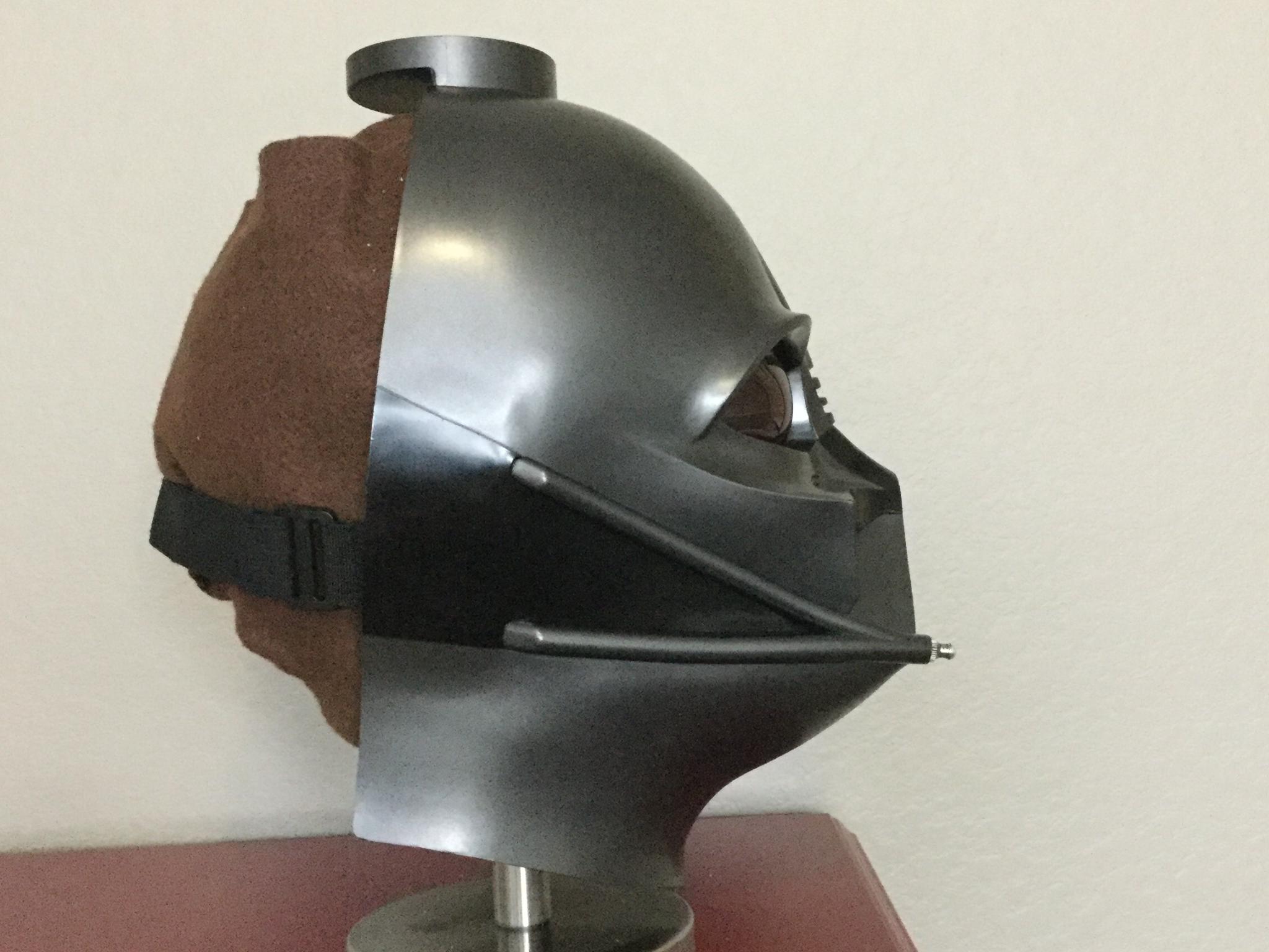
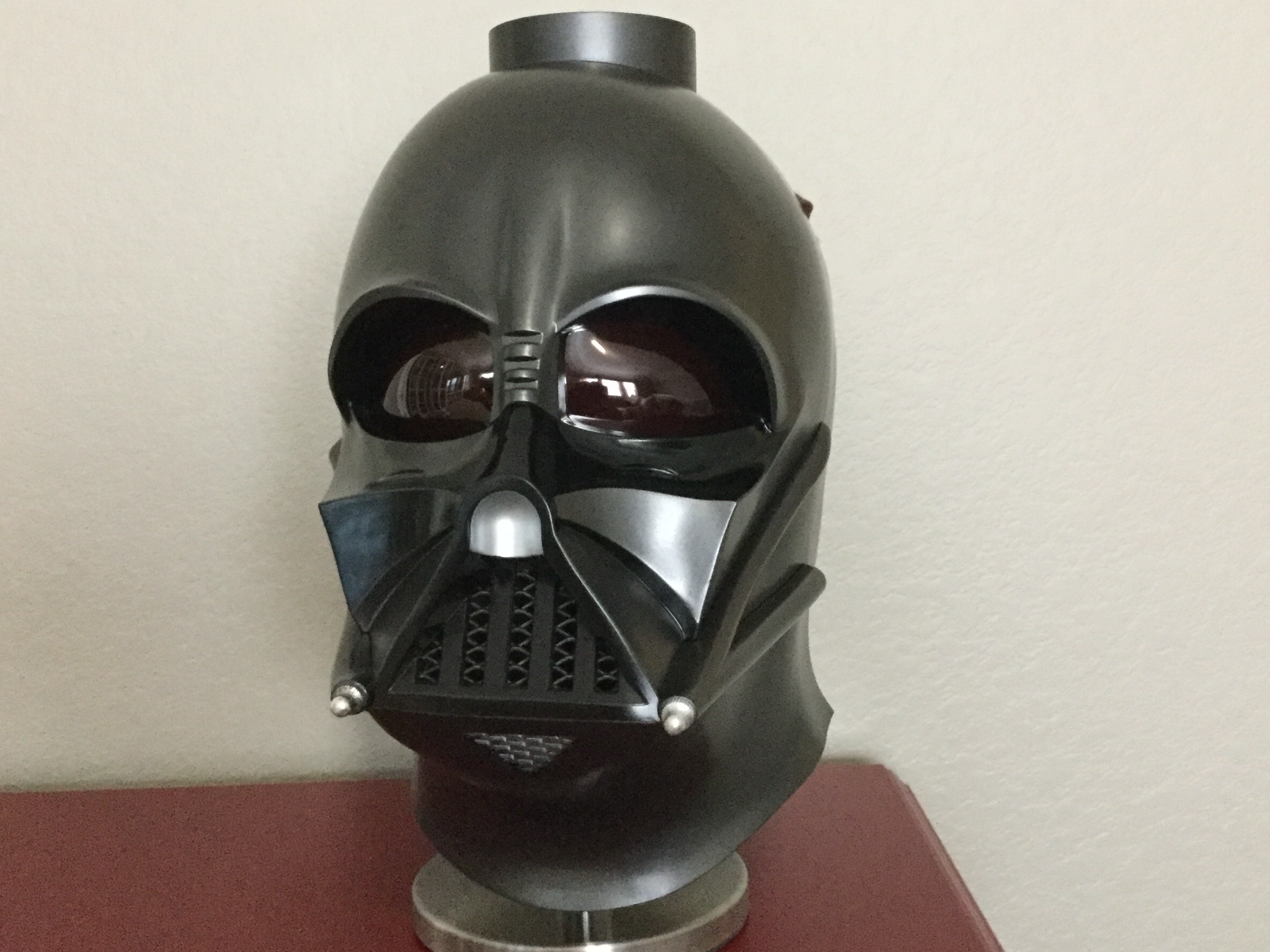
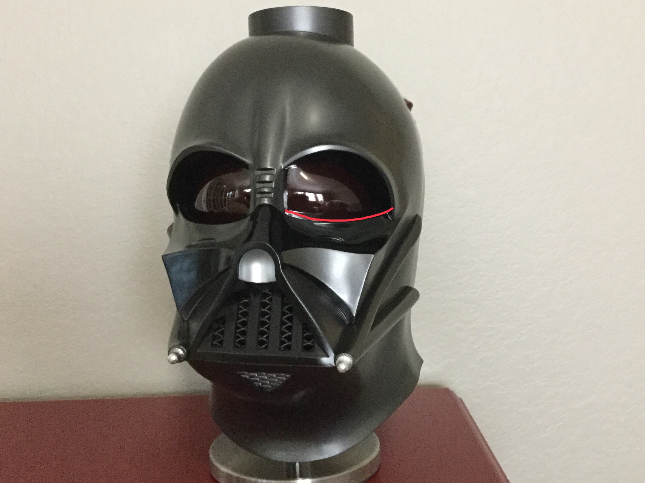


The above comment really eased my OCD...
For someone with panic over movie accuracy, who wanted an ESB Vader and ordered this figure, going through the last 100 or so pages hasn't really eased my thoughts [emoji3]
Both you and asgardianboy will sleep better.
m.
Maybe, I kinda see what you mean but the angles are a bit different though (the fig is more turned away from us and looking up more than the ref pic.) I posted these earlier and show the eyes a little better. The lower one's not as clear, and is comped to ROTJ:
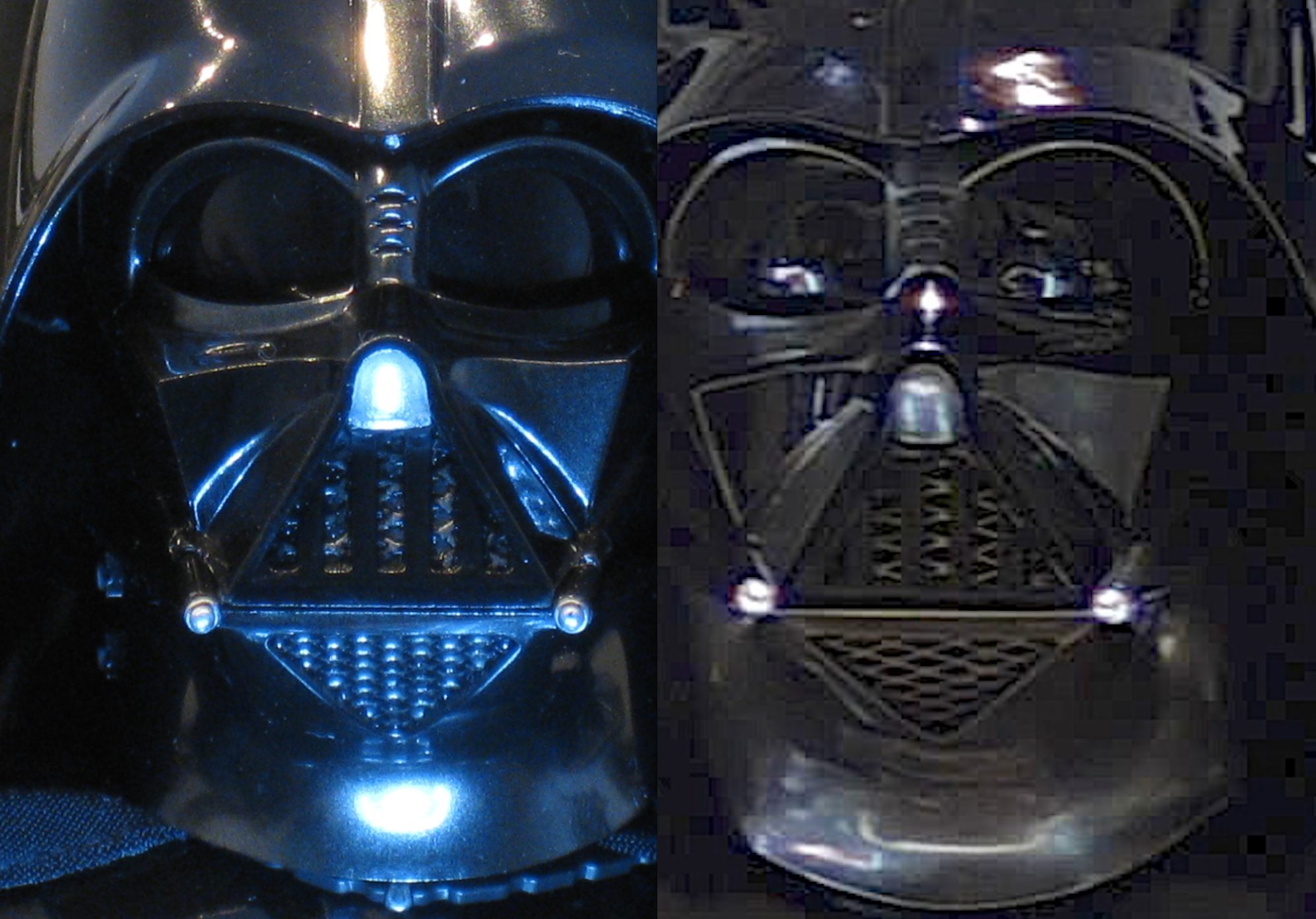
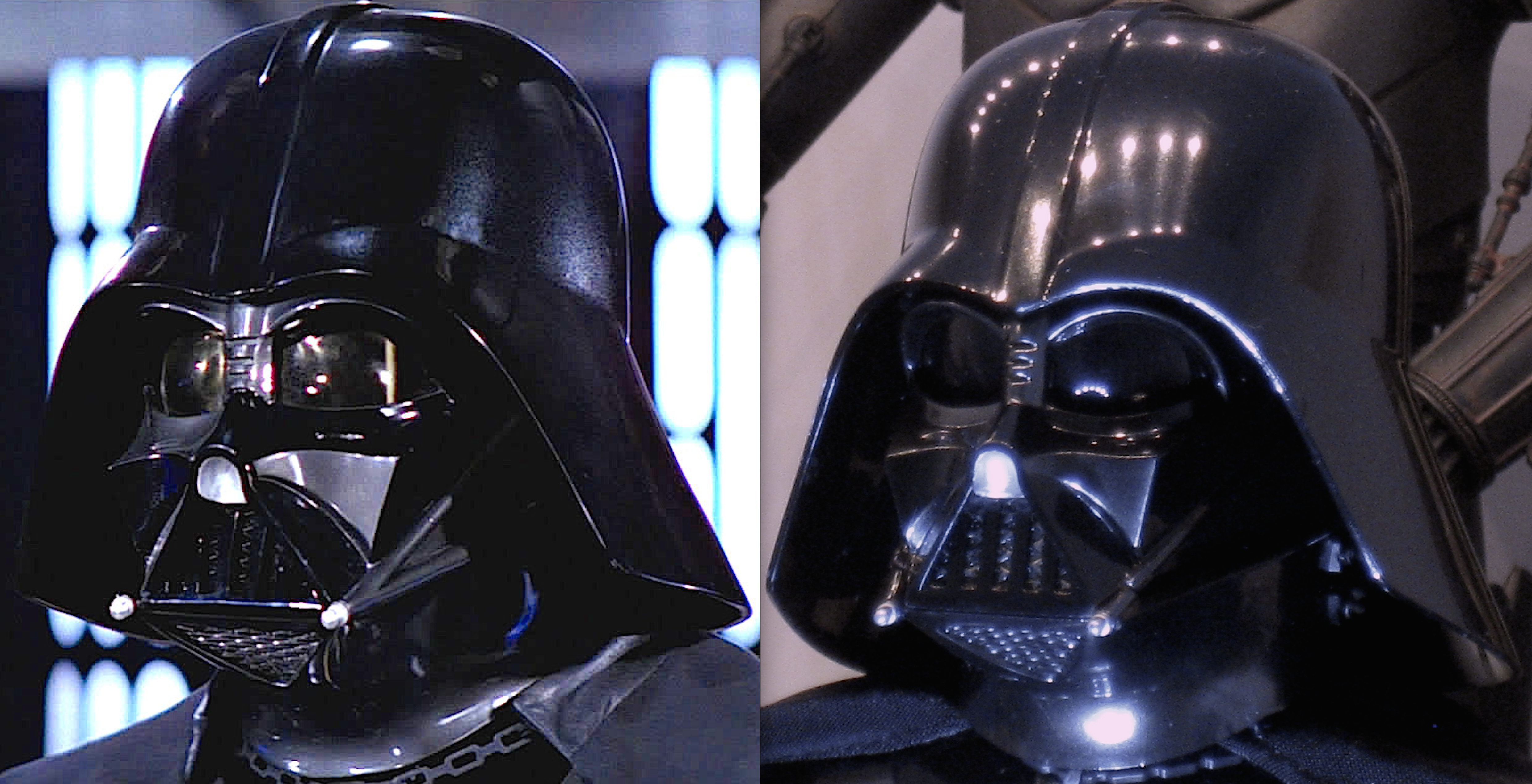
rayeknor
Super Freak
- Joined
- Jan 24, 2015
- Messages
- 1,138
- Reaction score
- 572
All you people still staring at photo comparisons are missing out on a fine figure. Doing it because you wish to justify getting/not getting it is fine but I see a lot of stuff in this thread being pure make believe. Best pics out there showing what proportions esb Vader has in hand are in my view the promo pics. It's not perfect but imo the best 1:6 Vader so far.
Someone comparing it to their 1:1 prop copy kinda knows what they're talking about I would say.
Besides the tusk tube cuts the only issue I have is the cheeks not slanting backwards the higher up them you go. Tho they both drown in all the things positive about this figure.
But its Vader.. there will always be another, collections are built on hope


$14.99
DC Comics, 12-Inch Superman Action Figure, Collectible Kids Toys for Boys and Girls
Bopster USA Inc
The more accurately sized R1 shoulder bells relieve the illusion of the short stubby arms...
View attachment 430643View attachment 430642
View attachment 430643View attachment 430642
I don't believe there was a dip on the screen used prop..Yours has that same big dip in the chest on the esb armor. Is it supposed to be like that?
I use thin pieces of foam...but bits of cut fabric material work just as well..Looks great, what did you use as padding?
Yes TESB chest armor with R1 bells....i just pushed the armor upwards a tad..Looks great...so you mixed the TESB upper chest armor with R1 chest bells? The chest armor looks kind of shorter more like R1. Even looks to sit slightly higher with some gap between the chest armor and light up feature. How did you manage that if this is TESB chest armor?
Like yourself one of the first things I did was stuff a bit under his shirt...small tears of simple safe cotton balls did the trick.
The eyes are just one of the many issues...but i really don't like the prominent bags underneath the lens which give it a bug eyed look that echos the awful SS deluxe sculpt.the eyes are the main problem for me in every single picture I saw so far. Look at how the bottom eyelid slopes upwards towards the side of the face in the figure instead of downwards in the real helmet. It makes him look "angry" like he's frowning or something and totally ruins the Vader look. I might have been able to tolerate the mouth and tusks if it wasn't for this.
In comparison the RO/ANH figure eyes are a bit too large but better shaped
Both are inaccurate but have their pluses and minuses...i like TESB chest armor a bit more at the minute...but that might change...Matrix, I think you need to put some more padding right under the lower portion of the chest box. Its bottom part sits deeper then top part and gives a crunching look illusion. BTW, why didn't you just put all R1 Vader chest-shoulder armor instead of just shoulder pad?
canofhumdingers
Super Freak
- Joined
- Mar 10, 2010
- Messages
- 427
- Reaction score
- 16
The more accurately sized R1 shoulder bells relieve the illusion of the short stubby arms...
View attachment 430643View attachment 430642
That looks phenomenal. I don’t have much urge to mod this guy, but I might go for the shoulder bells sometime in the future if I have the spare cash. That’s an easy swap with a significant payoff. Heck, I wonder if I could find (or make?) some on shapeways or the like for less than what I’d pay for a R1 armor piece...? I don’t mind doing some sanding and painting.
rayeknor
Super Freak
- Joined
- Jan 24, 2015
- Messages
- 1,138
- Reaction score
- 572
His arms arent actually short. When doing that iconic pose where he reaches out to Luke it is correct the shoulder pads add to the illusion, but most of it comes from Prowse rolling his shoulder forward when reaching out, like anyone would. Figures cant do that yet.. shouldn't really be hard to implement in a 1:6 size with suit or clothing to hide any gaps in the figure to accommodate improved rage of motion.
The eyes are just one of the many issues...but i really don't like the prominent bags underneath the lens which give it a bug eyed look that echos the awful SS deluxe sculpt.
Matrix or Lord Valefor, can you guys point out the error/s in the eye sculpt in these comp pics? Just trying to visualize it. I see issues in that area (for example, the silver post between the eyes - the "bridge of the nose" where the three slots are - seems too narrow to me, and the nose itself isn't quite long enough) but just trying to have the ah-ha moment in terms of the eye curve you guys mention. I see the very slight "too frowned" aspect to the inner brows, but in these pics its very subtle.
canofhumdingers
Super Freak
- Joined
- Mar 10, 2010
- Messages
- 427
- Reaction score
- 16
I’m not sure what Valefor is talking about, but I’m pretty sure matrix is referring to this crease under the eye creating a “bags under the eyes” look.
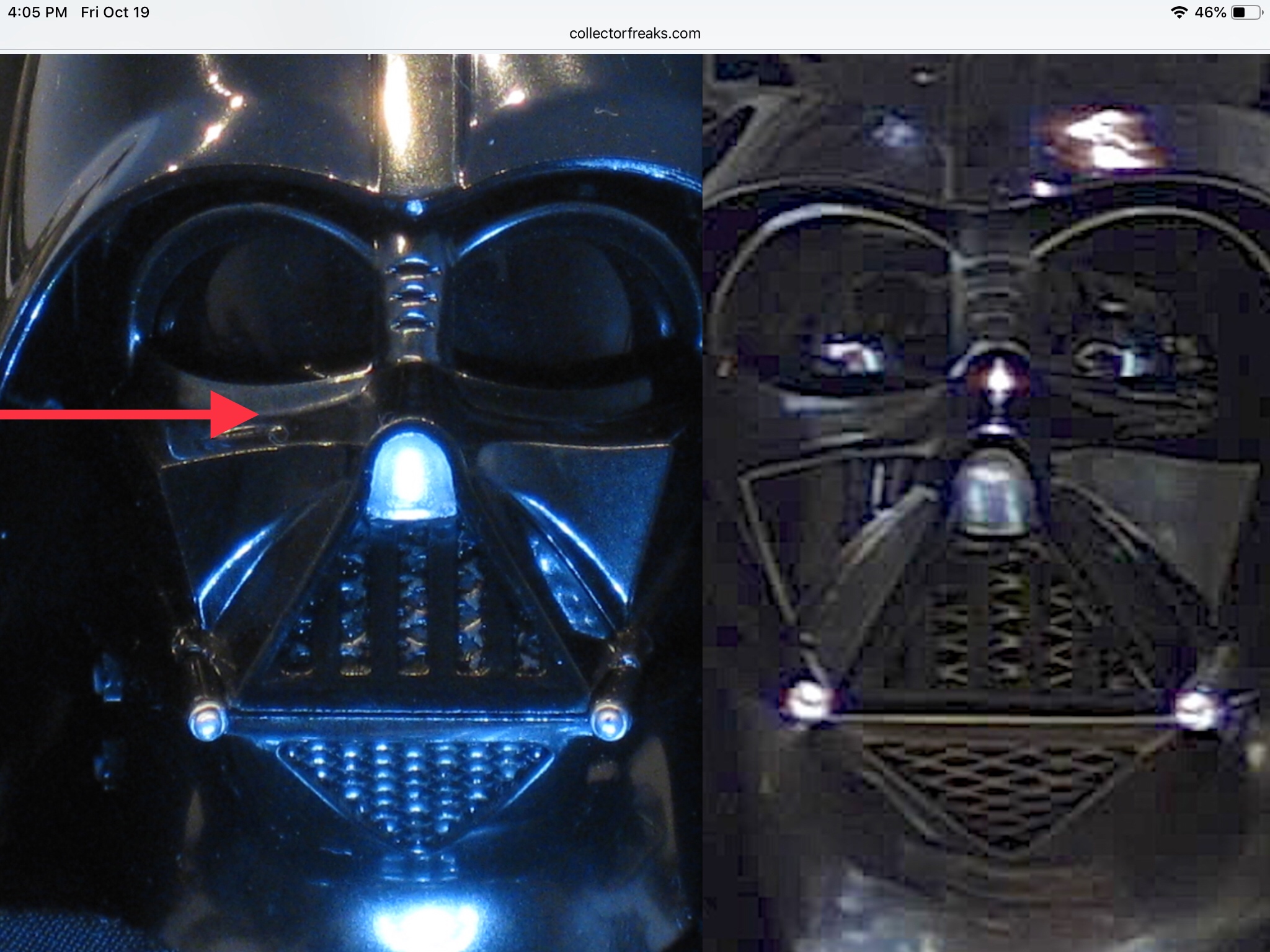
And Matrix is right, that crease is a bit too sharp with too much of an abrupt 90 degree change from horizontal top of the cheek to vertical eyelid. On the actual mask the transition is a slightly shallower and more subtle curve. To me, in hand, it’s not that bad. But it’s not 100% accurate.

And Matrix is right, that crease is a bit too sharp with too much of an abrupt 90 degree change from horizontal top of the cheek to vertical eyelid. On the actual mask the transition is a slightly shallower and more subtle curve. To me, in hand, it’s not that bad. But it’s not 100% accurate.
I’m not sure what Valefor is talking about, but I’m pretty sure matrix is referring to this crease under the eye creating a “bags under the eyes” look.

And Matrix is right, that crease is a bit too sharp with too much of an abrupt 90 degree change from horizontal top of the cheek to vertical eyelid. On the actual mask the transition is a slightly shallower and more subtle curve. To me, in hand, it’s not that bad. But it’s not 100% accurate.
Thanks - yeah, that sharpness of angle that creates the "bags" look is actually more visible in the second comp pic below the left eye lens:
canofhumdingers
Super Freak
- Joined
- Mar 10, 2010
- Messages
- 427
- Reaction score
- 16
Actually, this shot shows it more obviously
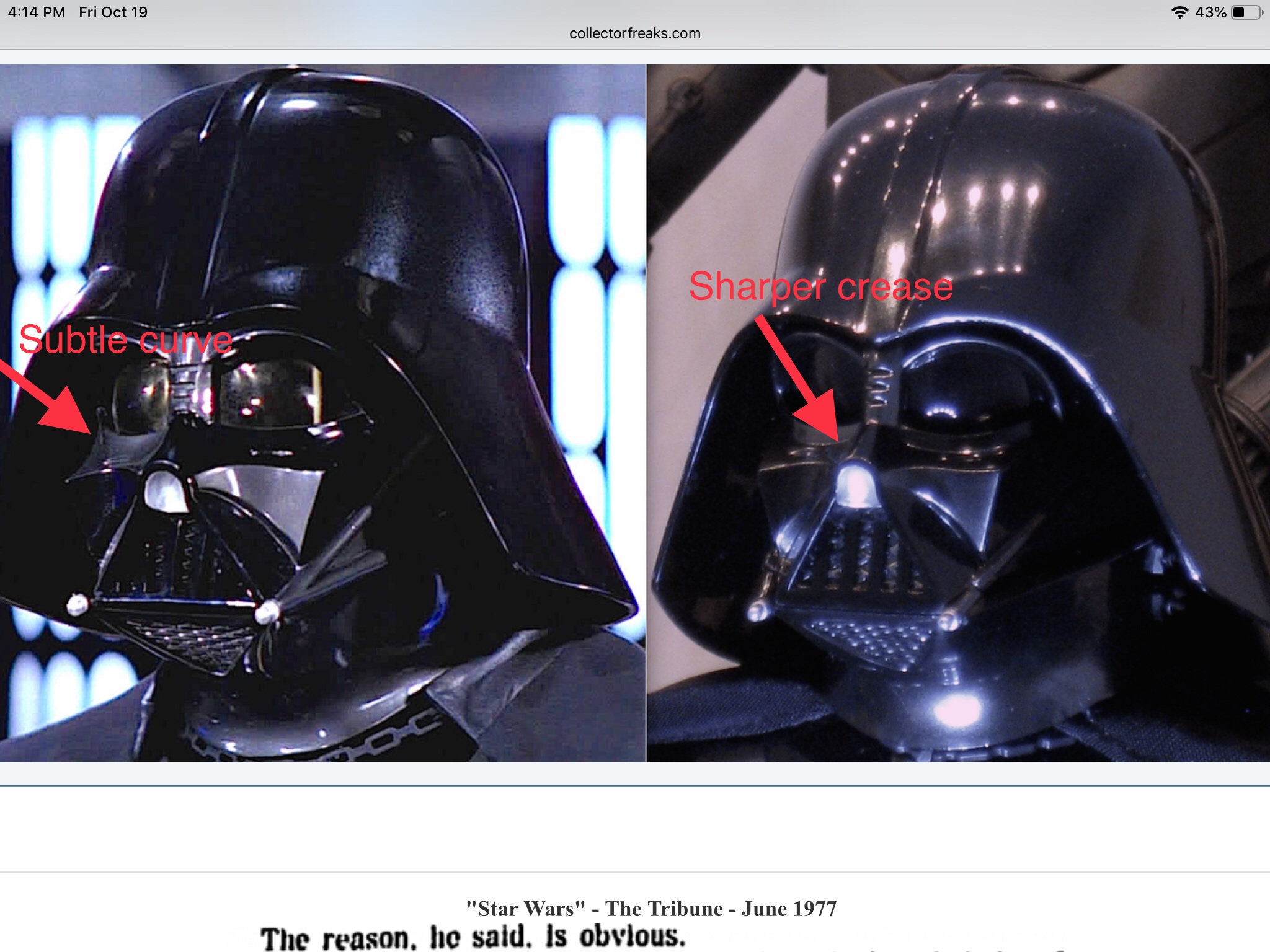
EDIT: beat me to it, lol

EDIT: beat me to it, lol
ajp4mgs
Super Freak
- Joined
- Jul 10, 2017
- Messages
- 2,305
- Reaction score
- 1,672
I’m not sure what Valefor is talking about, but I’m pretty sure matrix69 is referring to this crease under the eye creating a “bags under the eyes” look.
I think Valefor is probably referring to the same thing that matrix69 is, but just referencing it differently. My understanding is that he's been saying that the eyes look more "squinted" (or narrower) on the figure. If that's what he is indeed referring to, it's because of the bottom eye ridge that matrix69 pointed out (and that you and TaliBane recognized).
I've taken Talibane's comparison photo and traced lines around movie Vader's features. Then I moved those lines along the horizontal axis (no budging whatsoever on the vertical axis) to overlay on the HT Vader. There's no question that the eyes are more squinted on the figure, and that it's due to the bottom "eyelid" ridge. The red line I used to show the height of Vader's right eye is the best way to see how the ridge narrows the eyes.

And here are the two Vaders cropped closer together to make it easier to see the lines.

One of the things that the reference lines also show is that the HT nose should have extended forward more. Doing so would have made the angle of the "teeth" seem deeper (and more accurate). There's also inaccuracies that should be expected since a 1/6 scale helmet is difficult to reproduce everything correctly for, but the eye ridge, the nose length (and height), the size of the mouth, and the angle of the tusks should be better. In fact, some of these issues were better on the previous HT Vader mask.
@TaliBane: great job on the nose and tusk mods/fixes!

I slid the pics over on top of each other and the mismatch on the eyes doesn't seem as pronounced as your lines. I've matched the tallest part of the left eye from fig to screen pic (HT fig is on left, screen ref pic on right.)
I can see the frown/brow aspect, but the size diff doesn't seem too noticeable. Of course it's hard when you're super focused on a couple of pics. I also find that with hlemets like Vader and Fett, even just the slightest angle difference (in X, Y or Z) and the shape of sculpt aspects changes quite noticeably due to so many complex curves.
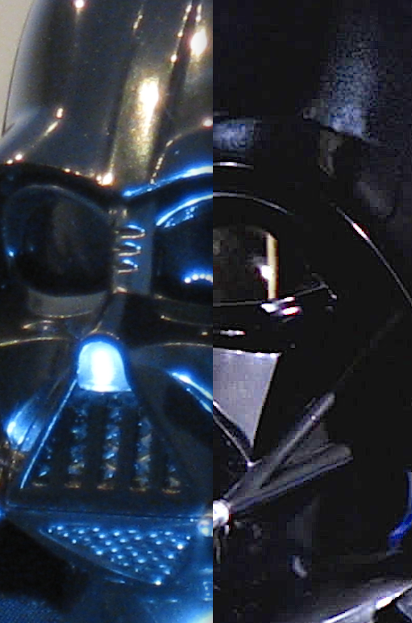
I can see the frown/brow aspect, but the size diff doesn't seem too noticeable. Of course it's hard when you're super focused on a couple of pics. I also find that with hlemets like Vader and Fett, even just the slightest angle difference (in X, Y or Z) and the shape of sculpt aspects changes quite noticeably due to so many complex curves.

Similar threads
- Replies
- 104
- Views
- 7K
- Replies
- 245
- Views
- 23K
- Replies
- 138
- Views
- 6K
- Replies
- 94
- Views
- 9K


