1/6 1/6 Hot Toys - MMS 452 - Star Wars: Episode V ESB - Darth Vader

Collector Freaks Forum

Help Support Collector Freaks Forum:

This site may earn a commission from merchant affiliate links, including eBay, Amazon, and others.
I've learned from this thread that no amount of picture comparisons will do this justice. I'm sorry but scrutinizing millimeters of difference is sort of pointless now. I started to dread opening the figure based on some of this stuff and it was pretty much unfounded. In pics these problems stand out but in hand its a different story. I'm enjoying the sith out this figure.
 
I've learned from this thread that no amount of picture comparisons will do this justice. I'm sorry but scrutinizing millimeters of difference is sort of pointless now. I started to dread opening the figure based on some of this stuff and it was pretty much unfounded. In pics these problems stand out but in hand its a different story. I'm enjoying the sith out this figure.

The tusk rail split is horrendous but besides that I love this figure. I've only had him since Wednesday myself. Looks great in display.
 
Sure I think HT could have done things better with this figure. But overall I think this figure is awesome and wins hands down compared to the SS version. For me it does represent the ESB version of him and he looks great next to the Bespin Luke.

Bring on the ROTJ version with the reveal head.

Some phone pics

b88d574e597801042d950cdc95e69dc3.jpg
5707217063d0b024e1fdaa1775d290cc.jpg
253fa8feda6f9b39471222dfac7457e9.jpg
 
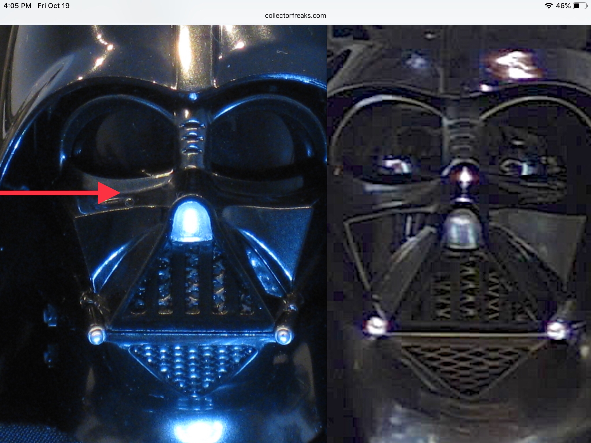
I’m not sure what Valefor is talking about, but I’m pretty sure matrix is referring to this crease under the eye creating a “bags under the eyes” look.

kXCZZgj.jpg


And Matrix is right, that crease is a bit too sharp with too much of an abrupt 90 degree change from horizontal top of the cheek to vertical eyelid. On the actual mask the transition is a slightly shallower and more subtle curve. To me, in hand, it’s not that bad. But it’s not 100% accurate.


Yes the bags underneath the eyes/lens shouldn't be there...they're way too sharp and prominent and stand out like a sore thumb...making it the Rami malek of vader masks:)

Here's another comparison...again HT got much closer to screen accurate on the ANH/R1 mask...the old Kaiyodo got a lot closer too and that was 20 years ago! HT need to up their game..

View attachment 430934

it's not the same thing at all . The ESB fencing masks and ANH mask both look like Darth Vader from the movies. I'd be happy with either reproduced perfectly in a 1:6 figure. I prefer the ESB helmet overall but it's basically the same shape as the ANH helmet with some minor alterations. There's not all sorts of proportion and angle issues going on like this figure and to a lesser degree the RO/ANH figure.

And right now the "least worse" of all the 1:6 headsculpts to date is the RO headsculpt

I'm just hoping HT realizes this and scraps this sculpt for 1/6 RotJ
Agree with everything...but unfortunately i can't see HT making a new mask for ROTJ version...
Many of us are so familiar with Vader, and considering how long he’s been the subject of high end collectible and the companies who make them, with today’s technology and access to the more obscure details, we’d expect they have the ability to produce at least a convincing likeness...enough to look as if it’s been mechanically shrunk or even created from digital files

But even the. Most obvious weirdness will stand out.
It's disappointing as this Empire mask is a step backwards..
 
Looks cool, Matrix. Its subtle, but helps the overall look. Did you just hit it with fine sandpaper?

Are you planning to expand the nose (or shrink the mouth triangle some other way) or get rid of the reveal brace greeblies/"frankenstein bolts"?

Those bolts kinda bug me on mine - they were never visible from the front in either ESB or ROTJ. The Kaiyodo one has them, but as you say, that's 20 years ago.

If I repaint the HT ESB mask (I think generalgrievous did, but hasn't shown pics yet) I may see if there's a way to fill those "bags" a bit and carefully sand it flat. Would be super tricky though and possibly mess up the tear drop scallops.
 
here is a the paint job I did on the mask. I posted a photo some pages back don't remember where in this thread but I will upload another.IMG_0463.jpg
 

Attachments

  • IMG_0463.jpg
    IMG_0463.jpg
    334.4 KB
Looks cool, Matrix. Its subtle, but helps the overall look. Did you just hit it with fine sandpaper?

Are you planning to expand the nose (or shrink the mouth triangle some other way) or get rid of the reveal brace greeblies/"frankenstein bolts"?

Those bolts kinda bug me on mine - they were never visible from the front in either ESB or ROTJ. The Kaiyodo one has them, but as you say, that's 20 years ago.

If I repaint the HT ESB mask (I think generalgrievous did, but hasn't shown pics yet) I may see if there's a way to fill those "bags" a bit and carefully sand it flat. Would be super tricky though and possibly mess up the tear drop scallops.

It would be easier to modify an ANH/R1 mask into an Empire version than try modify the stock Empire mask...there's just too much wrong with it. I still might try straighten the tusks and tweak the nose though.
To dull the inside of the helmet i used matte black acrylic paint..
 
That does look good. But i do find it a little funny that you dislike the “bags under the eyes” on the ESB mask so much when the R1 mask has them too.

Ugh, and I just realized after I said I was out of this thread, you just sucked me back in! Thanks a lot! Lol.
 
That does look good. But i do find it a little funny that you dislike the “bags under the eyes” on the ESB mask so much when the R1 mask has them too.

Ugh, and I just realized after I said I was out of this thread, you just sucked me back in! Thanks a lot! Lol.

The bags under the eye lens are subtle on the ANH/R1 mask and only noticeable under lighting...on the Empire mask they're sharp and prominent.

But that's only one issue...the eye lens don't sit deep enough in the sockets either and the nose bridge is too narrow....
View attachment 431050
 
For those interested here's the stock Empire vader with R1 mask and Empire helmet.Personally i think it looks great and with a larger chin vent and a few tweaks it would look near perfect..


View attachment 431036

Yeah, that does look better but the stock "nose plug" (which always creates a weird sort of double nose) and the "transistor radio speaker" pattern behind the teeth and in the vent (instead of the correct mesh) always puts off the look of that sculpt for me, especially on the RO version where the not-mesh is painted so brightly. Maybe the teeth area could be swapped out though.

And yeah, opening up that chin vent would be a pretty big job. And the amber lenses would have to be reversed for ESB.

The look of the eyes area is much better on that sculpt - you notice the bridge of the nose between the eyes is also correctly proportioned.
 
Last comparisons...i've Emailed and posted these to HT HQ..they'll probably delete and shred them...or worse still have me sectioned:) View attachment 431068View attachment 431067

You'll probably get less objection from HT for pointing out flaws than you will from some of the people who post here. There are those who (for some bizarre reason) are so bothered by detailed critiques/comparisons of this figure that they need to post their self-righteous musings about others who just want to see more accurate sculpts.

Your photo comparisons really illustrate how the HT ESB mask would have benefited from having the nose and mouth brought forward more. It not only would've helped the accuracy from the profile, but would have changed the neck by having more area under the chin. Also would've improved some of the slopes and angles of the cheeks.

Another great contribution from you to this forum. :clap Thank you for sharing your excellent photos and analysis!
 
Back
Top