You are using an out of date browser. It may not display this or other websites correctly.
You should upgrade or use an alternative browser.
You should upgrade or use an alternative browser.
Hot Toys - Iron Man 2:Mark IV Limited Edition spec
- Thread starter wookster
- Start date

Help Support Collector Freaks Forum:
This site may earn a commission from merchant affiliate
links, including eBay, Amazon, and others.
cr`
Super Freak
- Joined
- Mar 22, 2009
- Messages
- 1,373
- Reaction score
- 0
i looked back at the first promo pic in the 1st page, and you're right, it doesnt appear that different. but i'd rather trust my first impression. upon seeing pics of the legacy 1/4 statue, i immediately thought they nailed the proportion to a t. upon seeing pics of ht's, my thought was... close(closer than mark III) but no cigar.I was about to say I agree that it's too thin, but at least comparing direct tracings of the HT prototype pictures to tracings off that promotional art they seem almost identical in girth. I think the limbs might just be slightly longer (and by a couple millimeters at most) and the head is very slightly too narrow which makes the whole figure look thinner even though the body has the same girth.
Promo pic on the left, HT proto on the right. I used the first prototype pic for reference as it's almost the same shot as the promo pic.
dedguy
Super Freak
- Joined
- Sep 21, 2007
- Messages
- 6,448
- Reaction score
- 6
I took 5% off the height. I think it's that the figure is too proportionally tall. All the parts are the right girth, it's just overall slightly too long/tall. I think that may be in part because they want it to fit in the the mkII/III which is definitely proportionally too tall.
I think this looks pretty much exactly right (I mean other than the distortion caused my the artificial squishing).

I think this looks pretty much exactly right (I mean other than the distortion caused my the artificial squishing).


$44.99
Marvel Legends Series Deadpool, Deadpool 2 Adult Collectible 6-Inch Action Figure
S&A Distribution

$57.89
Marvel Legends Series Venom, Marvel Comics Collectible Action Figure 6” - Exclusive
Alliance Collectibles

$35.00
$39.99
San Diego 2024 Previews Exclusive Marvel Comics: Wolverine DS-151 D-Stage Statue
Amazon.com
plasmid303
Super Freak
I took 5% off the height. I think it's that the figure is too proportionally tall. All the parts are the right girth, it's just overall slightly too long/tall. I think that may be in part because they want it to fit in the the mkII/III which is definitely proportionally too tall.
I think this looks pretty much exactly right (I mean other than the distortion caused my the artificial squishing).
Yeah I agree. They just need to shorten his various appendages and torso proportionately without actually shortening the overall figure, which would require the entire thing to be slightly scaled up. Is that difficult to do in regards to manufacturing? They'd have to make the molds a bit bigger, right?
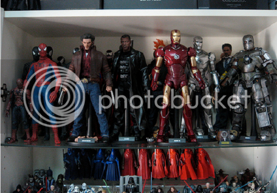
All HT needs to do to make me happy is to have the Mark IV look as if there could be a 1/6 body, albeit a thin one, inside the armor. The CGI suit in the film does that just fine. I can imagine that Robert Downey Junior really is inside the suit. With the Mark III, Hot Toys failed in that regard:
They got the height right on the Mark III, but he's too thin compared to other figures:

That's what the MKIV has to fix.
It seem they made WM the proper scale as to which it actually looks like there is a 1/6 Don C. in it, especially the pic with face mask off. I hope they do the same with the MK4 because if not, it will look very weird if Whiplash ends up looking exactly same size or bigger the the MK4.
dedguy
Super Freak
- Joined
- Sep 21, 2007
- Messages
- 6,448
- Reaction score
- 6
Well if they're working of 3D models then it's possible but if they're working off hand sculpted elements then everything would have to be totally re-sculpted from scratch I would think. I really have no idea.
I wouldn't be upset if they changed the figure, but likewise I wouldn't be upset if they didn't. I'm happy with it either way for different reasons.
edit: War Machine's waist, head, and upper arms are all about the same size as the mkIV. It just has bulkier armor in certain places, most notably the shoulders and legs.
CaptnRex
Super Freak
Wow, great pics on page 1, just had to read a heap of pages to catch up on the discussion.
Looks great, I just want it to look bulky enough and in scale enough to give off the impression that it has 1/6 Mr Stark inside the suit.
Looks great, I just want it to look bulky enough and in scale enough to give off the impression that it has 1/6 Mr Stark inside the suit.
No, the paint finish. In the real photos it looks like someone has been handling it for far too long like the original Mark 3. Like heading towards matte sticky surface plastic.
In the promo shots it's lovely and rich/deep very vibrant and doesn't look plastic.
It's a bit better here but it just doesn't look as beautifully smooth as the promos.

In the promo shots it's lovely and rich/deep very vibrant and doesn't look plastic.
It's a bit better here but it just doesn't look as beautifully smooth as the promos.

Last edited:
plasmid303
Super Freak
Like dedguy said, I'd attribute it to the photo quality in the pics of the store display. I think waiting for pics from Tommy Richardson would be more fair in order to examine the paint on the macro level.
plasmid303
Super Freak
The thing is, the Mark 3 doesn't look like that pic even with your very own eyes.
My Mark 3 looks like what you see in #233.
You mean the Mark III battle damaged version? If you meant the original Mark III figure, then...I don't agree.
Perhaps I'm not seeing the flaw that you are in that store display pic. To me, as long as the Mark IV looks like the battle damage Mark III figure in terms of paint quality (just without the BD effects), it's all good:

(Photo: OMG)
villainsfan42
Super Freak
Yeah because the promo photos where taken in a studio setting by a professional not by someone shooting through glass inside under florescent lights.
dedguy, you're absolutely right. when a professional takes it, with all of their equipment, special cameras, lighting, photo tents, etc...it will look a hell of a lot better than some random guy takin a photo. sorry, vodoun, but you're dead wrong. and imo the paint finish still looks absolutely great in those last few photos.
and that's a great photo, plasmid.
villainsfan42
Super Freak
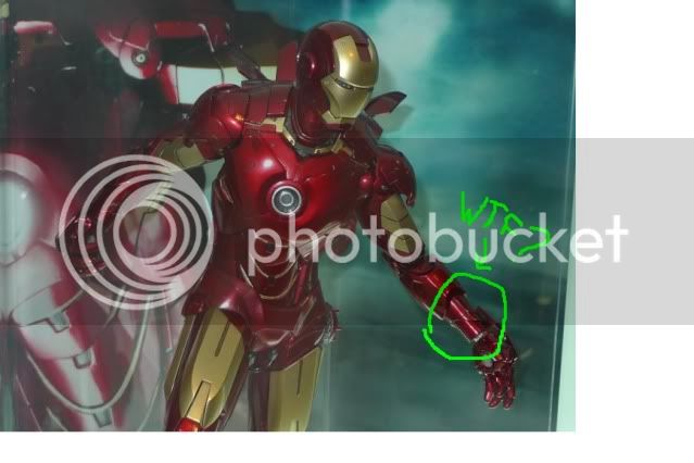
my only hang up so far is with the wrists. how could a human arm fit in there?


Similar threads
- Replies
- 107
- Views
- 7K
- Replies
- 80
- Views
- 7K
- Replies
- 101
- Views
- 6K


