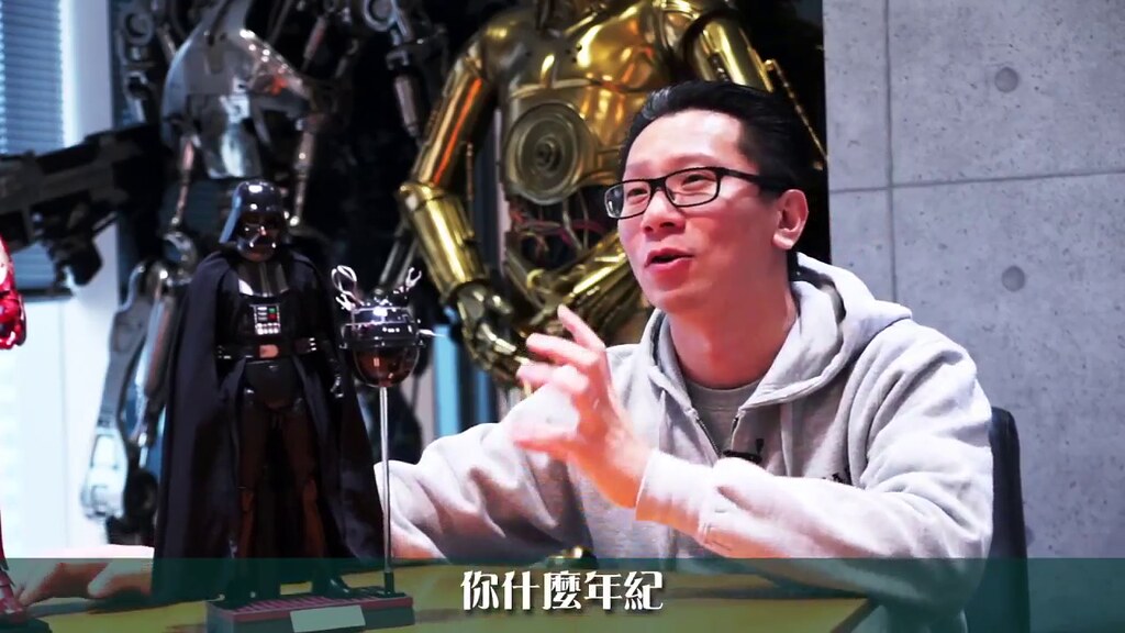
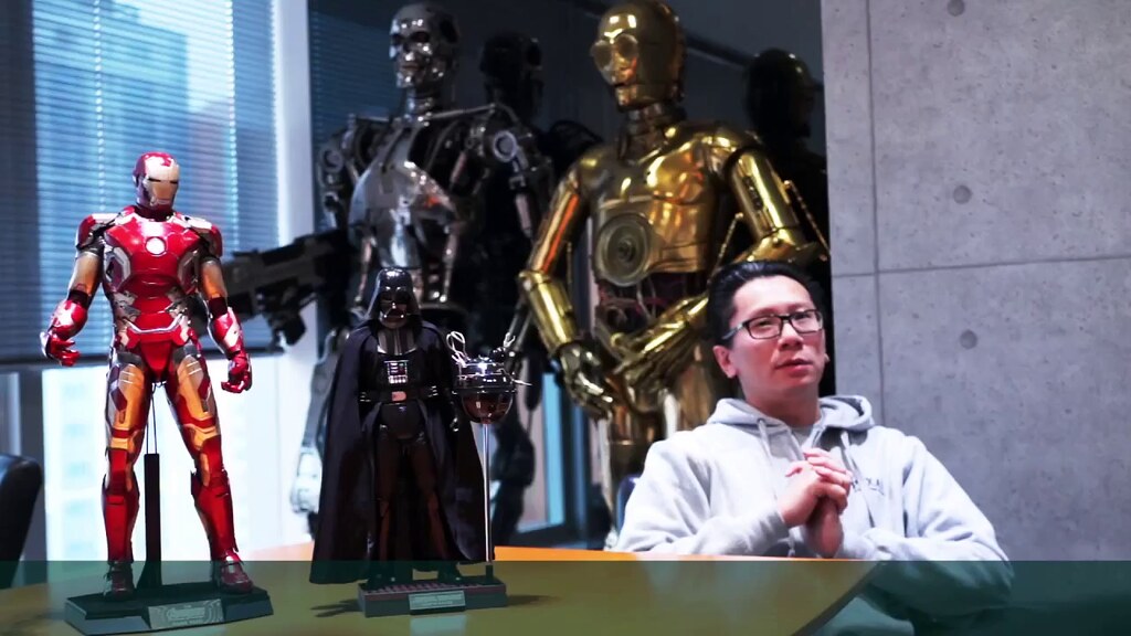
I went back this morning and looked through the SSC Vader 2.0 photos. In particular, looking for shots with less lens distortion to get a better view of the mask and helmet.
While both SSC and HT have their flaws (now documented ad nauseam so I won't repeat them) at this point in time I think I'd actually lean towards the SSC...dying to see production photos. The main thing is if HT ends up with a better ANH Vader than they've shown, it bodes well for an ESB version down the line.
Mods in general I can deal with, but those SSC bodies are annoying as hell. I guess that's why I'm wishing for a better HT version.
This should not be the most pressing issue this morning. I'm gonna go out and get some fresh air.
The SSC mask really is quite off, especially on the mouth triangle. The black and higher contrast lighting hides the issue in some pics, but it's quite obvious. I posted this last month, taken from varied sources:

The HT definitely has a drooping face, but I think the overall shape looks better. Hard to say when it's just a proto though.
Hot Toys Vader, Prop helmet, Sideshow Vader.

You can see one major HT issue is the line of silver paint on the nose being way too far into the nose - it would be a simple fix, but it has a huge effect on the overall look.
Biggest problem is all are way too tall, and it really can't be fully fixed (armor sized for oversize height, looks a little off even on shortened body.) HT will have same issue.


 Damn that vader is almost as tall as a 1/4 mk43.