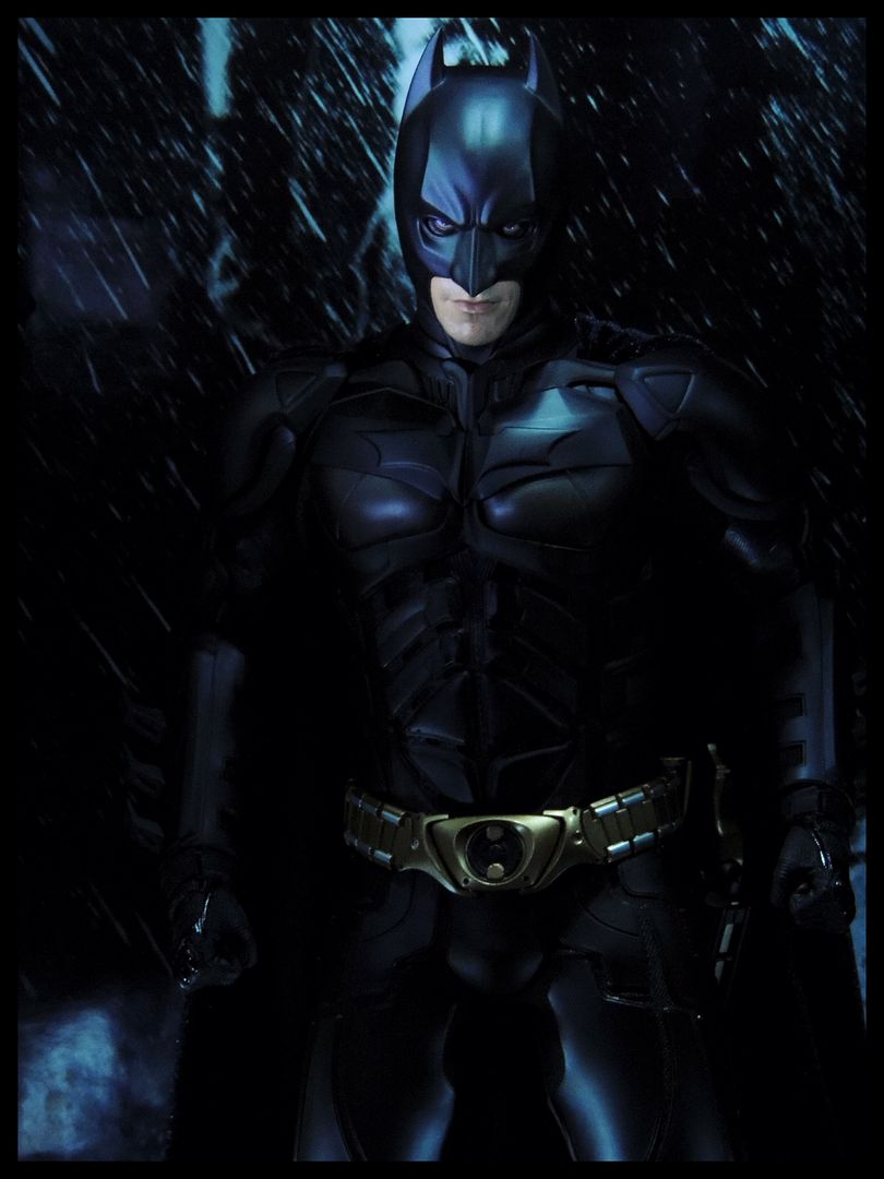
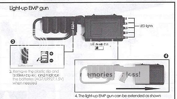
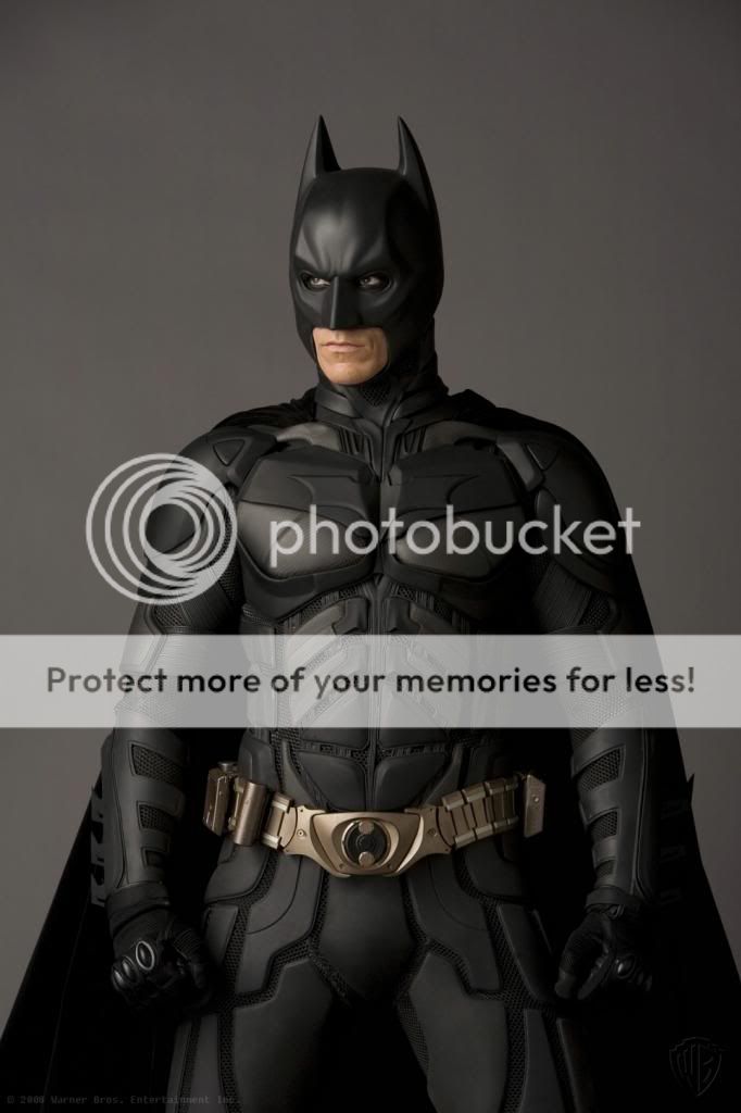
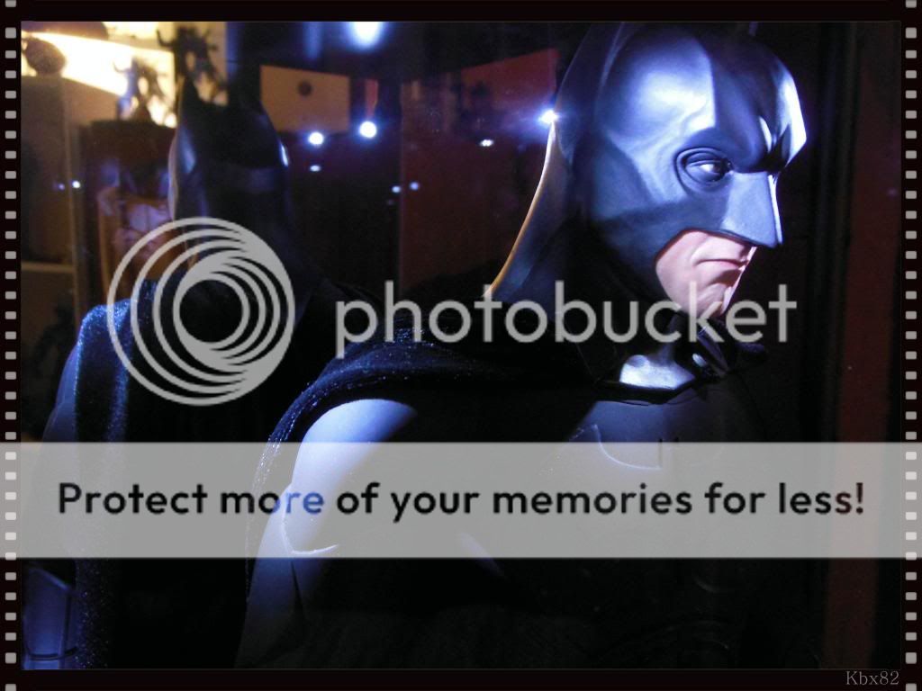
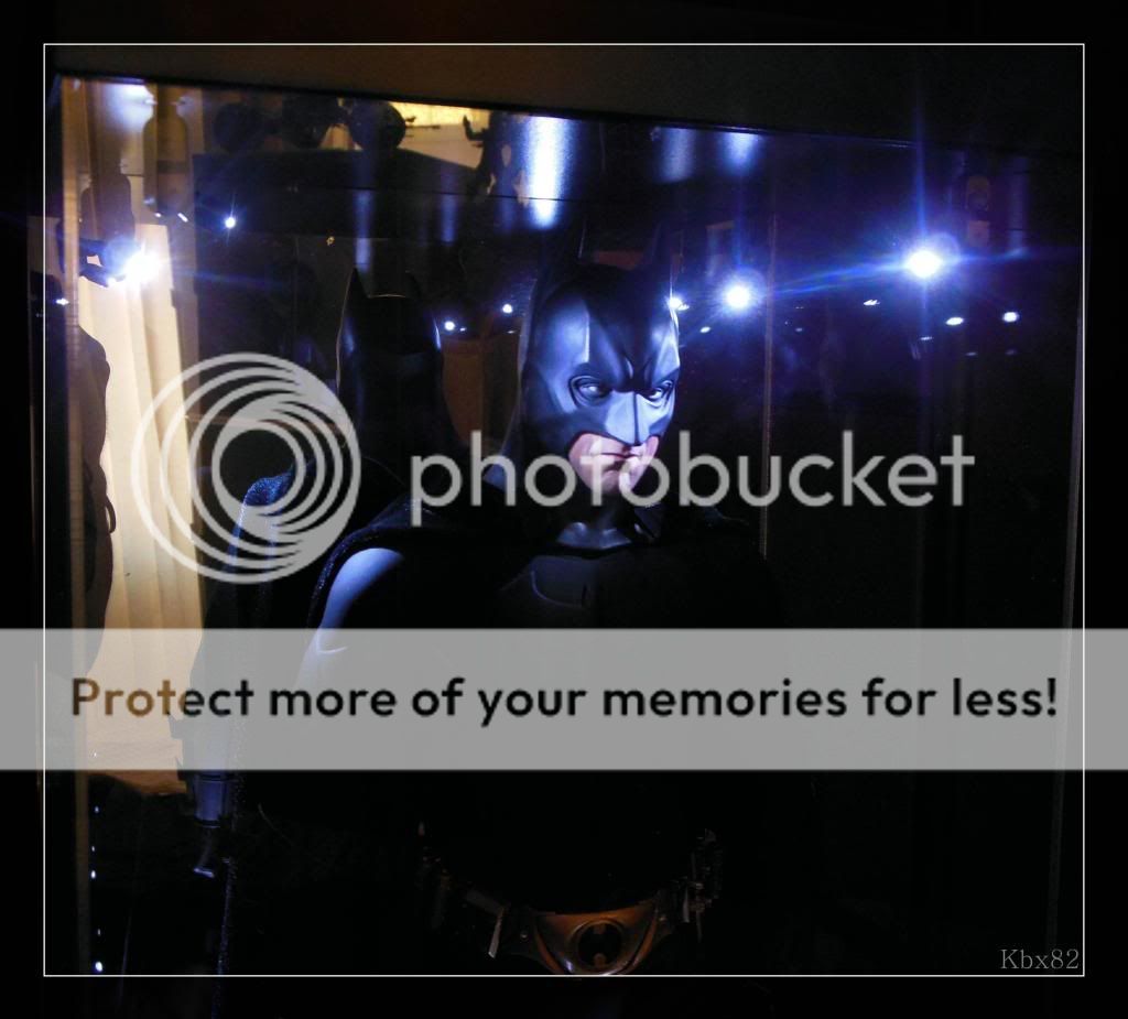
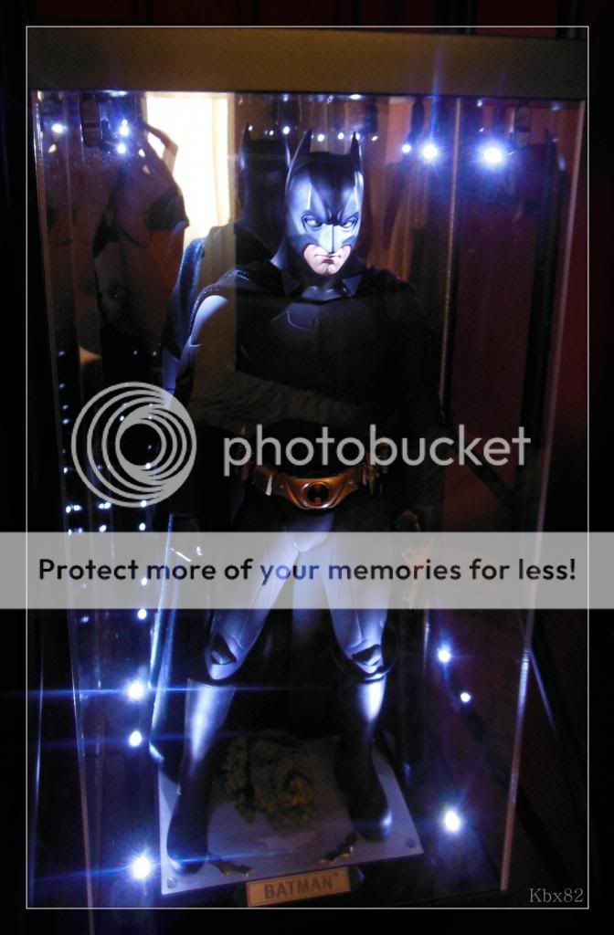
Such pictures can be misleading, the way the picture is taken and the figure futzed can produce dramatically different results.
For example here's a Jingobell picture looking closer to the poster in proportions, if the figure's neck was a bit thicker we'd be there:
Here's a picture of the real deal looking close to the picture above in proportions:
There are just too many variables for such picture comparisons.
I will grant you that the figure's head is (very) slightly undersized which could also be accentuated by the neck being a little too thin when viewed at some angles.
Hot Toys has a tendency to idealize their figures, finding a compromise between the "actor in a suit" look and a superhero transcending reality.
I think is a good thing, actors in a suit can look really awkward, it takes a lot of professionals to film them expertly so they end up looking like superheroes.
I wouldn't want a figure looking like some goofy snapshot from a movie but one that embodies the character we see and perceive throughout the film.
About the shoulder pads, I believe that if they were as close to the body as they are on the real thing there wouldn't be any possible shoulder movement.
It's part of the compromises figures have to make, I think in this instance HT did a great job.
It looks better in my opinion than what you did with the DX12 shoulder pads, it is one of the few mods I didn't think was successful making him look worse like he has droopy shoulder.
I'm not bashing your work here but I have a different take on some of the details.
It is of course all a mater of taste.


