Voorhees27
Super Freak
I don't think anybody's said that they prefer it more, just that it's a refreshing design compared to the norm.
That's where i've always been at.


I don't think anybody's said that they prefer it more, just that it's a refreshing design compared to the norm.
Why are people hating on the new suit? It looks great.
Were there this many complaints about the Mark...uhh..the silver and red one? Why does it have to be exactly the same every time?
I love his traditional design, but I hope that every once in a while we get something fresh like this.


Indians are considered Asian. I think you mean Oriental.

No, Asian. Rugs are "Oriental".
Seriously though, I'm talking about race/ethnicity as opposed to geography.
Indians are not Asian. Is India IN Asia? Yeah, but that's geography not race/ethnicity.
In general or just in the movie? I'm not feeling the on screen suit and I thought maybe I was biased because I love the Iron Patriot comic look and not giving it a fair chance.

It's ok for a comic design, but it's not something that doesn't looks practical at all. I didn't read comics , so I have no biase for the costume either way, it just doesn't seem practical. I could see it as being a gimmick armor and then being used only because all of Starks armory get blown up, but that doesn't look like the case. If Cap got an armor, then I guess I could see it.
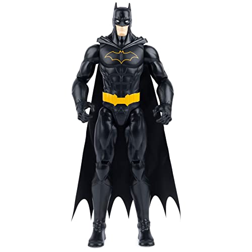
@ "practical." Semantics aside, the new costume looks about as appropriate for Iron Man as this was for Batman.


It's ok for a comic design, but it's not something that doesn't looks practical at all. I didn't read comics , so I have no biase for the costume either way, it just doesn't seem practical. I could see it as being a gimmick armor and then being used only because all of Starks armory get blown up, but that doesn't look like the case. If Cap got an armor, then I guess I could see it.

Semantics aside, the new costume looks about as appropriate for Iron Man as this was for Batman.
Its not anywhere near THAT bad.
I think much of the problem is that the non-red areas are too expansive, and the gold that replaces it isn't really GOLD. Its a frosty beige/taupe and much less visually pleasing.
The physical construction of the suit, as in the actual placement of the armor-plating isn't really an issue.
If the new suit had the red/gold in the usual places we'd be hearing "OMG AMAZING" and "I can't tell the difference from the previous armors".
There's nothing wrong with the actual armor design. Nor the color IMO.
Maybe if it had neon colors that would be an apt comparison.
But it's the US Air Force's (Rhodey's) armor.
Ok, let me put it this way, what air force guy would ever wear something that colorful, in any situation? The WM armor was bad ass and something I picture a guy like Rhodey wearing or any military guy for that matter.
Are we really going to say this new suit which is pretty damn good looking is on the same level as that crappy batman suit from a crappy batman movie? Good Lord.

Are we really going to say this new suit which is pretty damn good looking is on the same level as that crappy batman suit from a crappy batman movie? Good Lord.