Iron Man 2: 1/6th scale Mark II (Armor Unleashed Version)

Collector Freaks Forum

Help Support Collector Freaks Forum:

This site may earn a commission from merchant affiliate links, including eBay, Amazon, and others.
For all we know the head or neck aren't all the way down in the proto pics.

I mean for the VI they used the Mk III BD head for the proto pics so who knows...
 
the long neck thing is really frustrating to me. it's so obvious and so easy to fix, i just dont get why after so many mark suits ht made it's still there uncorrected. it's why i only own mark I so far and no others. just cant bring myself to buy these long neck marks.

cera2.jpg


" Three horns DONT play with Looooong necks! "
 
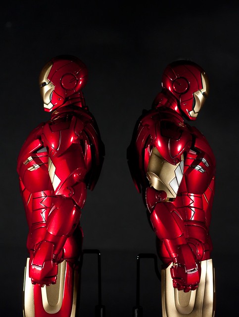
I posted this on OSW but it could very well just be a pose issue. The proto pics all look to be posed like the Mark IV in this pic while thoe pose the Mark VI is in could very well be possible and will vastly improve the appearance of the head/neck/shoulders.

5627762913_8d1030b50e_z.jpg
 
It can look way too long and WAY too skinny though in alot of the proto pics:

25505534.jpg

76104388.jpg


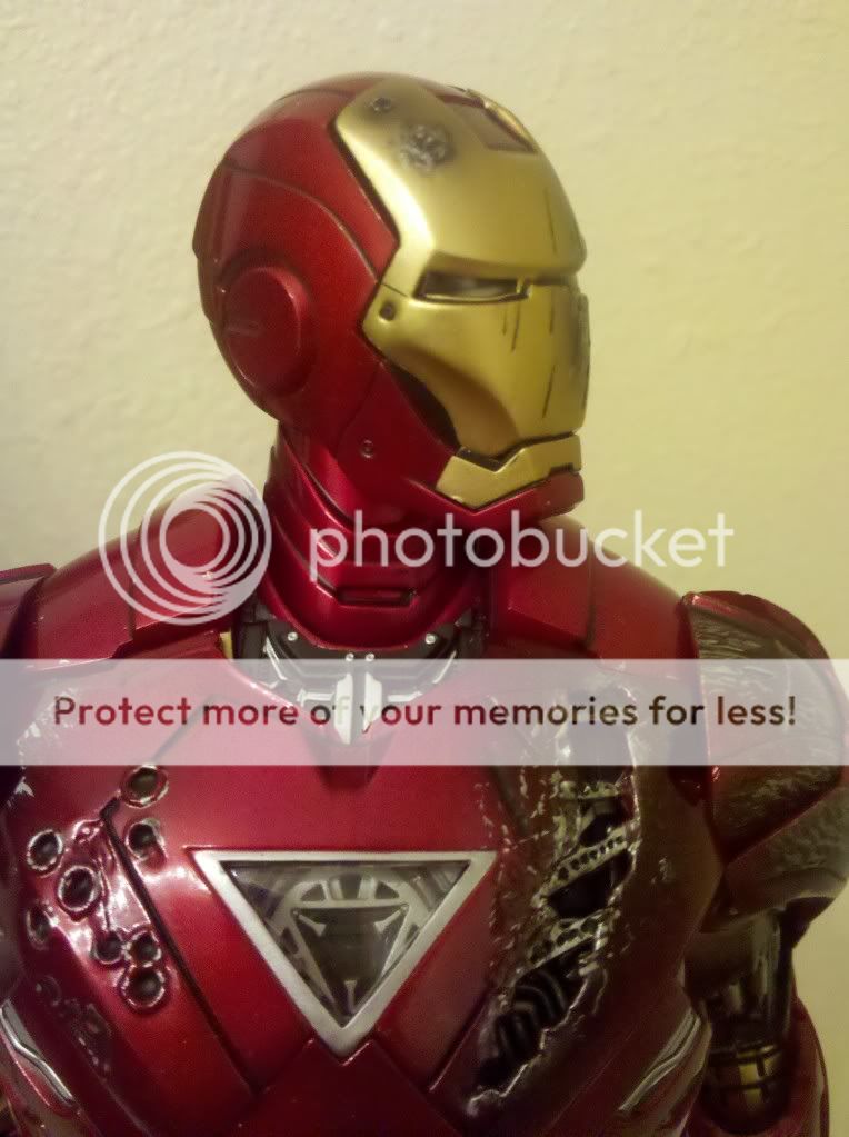
I really think they changed the neck in the final product. It looks SO skinny there.
 
Well it does have the wrong head on too...the neck is exactly the same as the IV however I do believe the ball joint it sits on is slightly different
 
The Mark IV and especially the Mark VI looks alot skinnier in Hot Toy's photos than in any of ours. I've come to think that generally with Hot Toys the final product will look better than the preview/proto pics.
 
The neck used in the proto pics is from the BD mk3 which has the "light bulb ball joint" placed way too high to begin with which is why it looks longer
 
" Three horns DONT play with Looooong necks! "
:lol

that xenophobic three horns.


It can look way too long and WAY too skinny though in alot of the proto pics:

I really think they changed the neck in the final product. It looks SO skinny there.
changed a bit in the final, but still skinny. the head should be slightly wedged in between the trapezius, instead of hovering above them. these mark suits are armor suits, not spandex. this is what ht seems to never get when in comes to designing the ironman figs. if the armor suit is already thin and the neck thin and long, how anorexic must tony be to fit into the suit?
 
Last edited:
Well it does have the wrong head on too...the neck is exactly the same as the IV however I do believe the ball joint it sits on is slightly different

The Mark IV and especially the Mark VI looks alot skinnier in Hot Toy's photos than in any of ours. I've come to think that generally with Hot Toys the final product will look better than the preview/proto pics.

That is definitely not the same neck that is on the released figure.

changed a bit in the final, but still skinny. the neck should be slightly wedged in between the trapezius, instead of hovering above them. these mark suits are armor suits, not spandex. this is what ht seems to never get when in comes to designing the ironman figs. if the armor suit is already thin and the neck thin and long, how anorexic must tony be to fit into the suit?

It can look way too long and WAY too skinny though in alot of the proto pics:

25505534.jpg


I really think they changed the neck in the final product. It looks SO skinny there.

The reason that the neck/head attachment is so long and skinny in this picture is because of the pose. Fresh out of the box, this pose is impossible, without having the helmet unattached.

Think about it. If the neck was as short as all of you want, there would be NO articulation. There's very little as it is, due to the helmet design and the height of the trapezius muscle/armor. Grab your Mark IV/VI. Try it yourself.

Even with the extra helmet that I cut up, it still has a very limited range of motion, and I'm not willing to start hacking up the jaw.
 
The reason the neck is so long in that pic is because it's th BD mk 3 neck not the new mk 4/6 neck,

I have both and they are too long anyway :dunno
The only reason HT continue to make IM's necks so long - invalid scale since the first release and mobility in the neck area.
 
Last edited:
The reason that the neck/head attachment is so long and skinny in this picture is because of the pose. Fresh out of the box, this pose is impossible, without having the helmet unattached.

Think about it. If the neck was as short as all of you want, there would be NO articulation. There's very little as it is, due to the helmet design and the height of the trapezius muscle/armor. Grab your Mark IV/VI. Try it yourself.

"no articulation"? at all? it's all a matter of degrees. with shorter neck the head will still be able to look left and right, up and down, just not as far as you could with a longer neck. but this is all just speculation on our parts. what is fact though, is that ht just loves to pay tribute to giraffe from time to time.

will the articulation for the bat dx's head be severely limited with a shorter neck? will arnie's? how bout rocky's or ivan drago's?
 
anyone remember this?

8IronMan_Mark3BattleDamaged.jpg


is there a space for even an anorexic in there? the legs are now improved for the new marks, but to me the neck is still as ridiculous as the pic above.
 
Even with the extra helmet that I cut up, it still has a very limited range of motion, and I'm not willing to start hacking up the jaw.

Bad design by HT.... They should have designed a neck with better range of motion (like double ball joint of TrueType neck, or even magnetic attachment like the PERS head of DX02 Bats)... while the LED, batteries and switch could located behind the face mask in the head..... PATENT PENDING....
 
Last edited:
Back
Top