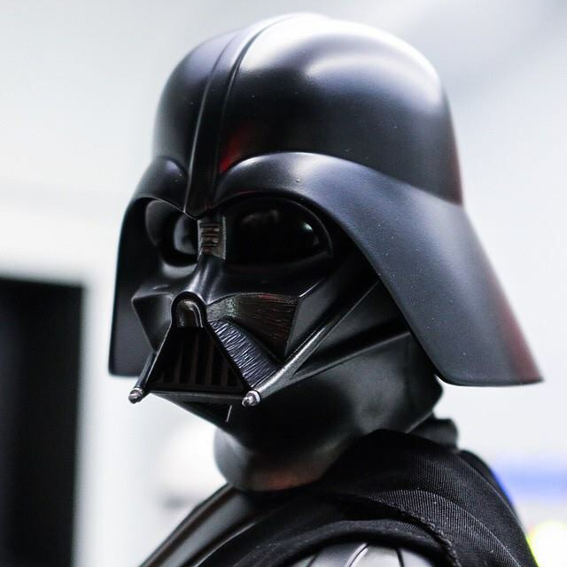
Its starting to look good to me too.
You are using an out of date browser. It may not display this or other websites correctly.
You should upgrade or use an alternative browser.
You should upgrade or use an alternative browser.
1/6 Hot Toys - MMS 279 - Star Wars Episode IV: 1/6th scale Darth Vader
- Thread starter SwedishHeat
- Start date

Help Support Collector Freaks Forum:
This site may earn a commission from merchant affiliate
links, including eBay, Amazon, and others.
YankeesFanboy
Super Freak
Great comparison pic, matrix. These concerns have already been articulated, but it should flare out a bit more. And I wish the eyebrow ridges were a bit meaner-looking.
Patriot666
Super Freak
The eyes look a little bit to big to me. Wide eyed makes for a look of innocence. Then again, this is Disney.
Invictus Sol
No Life in the Void
That's one of the things I really like about the HT version, as none of the previous versions have captured that wide-eyed look I like about Vader's mask. To me those eyes look more like a spider's or insect's than innocent, but it's all subjective. Medicom's I thought went into innocent/cutsey territory.
- Joined
- Apr 19, 2013
- Messages
- 10,918
- Reaction score
- 4,797
A lot of it has to do with the fact that a lot of the shots we see of 1/6 toys utilize angles or lighting conditions we never saw on-screen. I suspect this Vader can look miles better than it does in many of these photos.
Still looks like they need to lower the dome a bit more, which is especially apparent when you lighten those pics up:

Unfortunately once you do that the top of the dome might look a bit too short on him, and the skirt too long....
So ultimately I still think your best bet is using the old Hasbro dome instead.

Unfortunately once you do that the top of the dome might look a bit too short on him, and the skirt too long....
So ultimately I still think your best bet is using the old Hasbro dome instead.
Blackout
Super Freak
- Joined
- Apr 24, 2011
- Messages
- 485
- Reaction score
- 366
To me the helmet looks like a cross between ANH and ESB. The "brow" proportions and angles look more like ESB, but it comes to a point like ANH, and it might rest of the face a little too high more like ESB. Also I didnt see the dimple in the middle.
And where are the subtly red eyes? Even in person I couldnt really see any red.
And where are the subtly red eyes? Even in person I couldnt really see any red.
Too Much Garlic
Super Freak
The eyes look a little bit to big to me. Wide eyed makes for a look of innocence. Then again, this is Disney.
The problem is the dome making them look that way. The face mask is actually quite decently sculpted. They just need to fix the dome. Make the crown wider, narrow down the eyebrow surface and then shorten the dome skirt, as it looks too long. If they want they can also fix the center ridge that goes down to the Y-crease widows peak.
shocktrooper_au
Super Freak
By the side pick the dome is half the height it needs to be, well not half but a bit taller
bransen2099
Super Freak
Just preordered no way I could pass him up, but if HTs does a 1:6 ESB, tsk tsk 

shocktrooper_au
Super Freak
I think they'll do the others but I'm guessing after any initial TFA announcements, they seem to be getting ANH figures done to clear the way
mrshurricane
Super Freak
Nice shot,the flare looks pretty good there. Despite a few things being off that i hope get tweaked i still think it's very impressive and easily looks the best 1/6 vader produced so far
View attachment 181393
Mouths too small
S x
Hologram AI
Super Freak
- Joined
- May 7, 2013
- Messages
- 10,789
- Reaction score
- 12,921
Not sure if this is new but I haven't noticed it until now. It looks like they actually tried to implement the scratched weather look onto the mask. Done is clean but you can see it on the mouth area.


Not sure if this is new but I haven't noticed it until now. It looks like they actually tried to implement the scratched weather look onto the mask. Done is clean but you can see it on the mouth area.

Hmm. Very subtle.

Facemask looks better though, dome not so much.
Wth happened to his head!!!! It's so tiny :eek
shocktrooper_au
Super Freak
Need to angle that dome
every time i look at that its just looks too small! Besides the dome issue and brow, the mouth looks too small and the face too thin/narrow.
Similar threads
- Replies
- 241
- Views
- 17K
- Replies
- 94
- Views
- 7K
- Replies
- 307
- Views
- 24K
- Replies
- 266
- Views
- 18K


